Visualize the Bootstrap
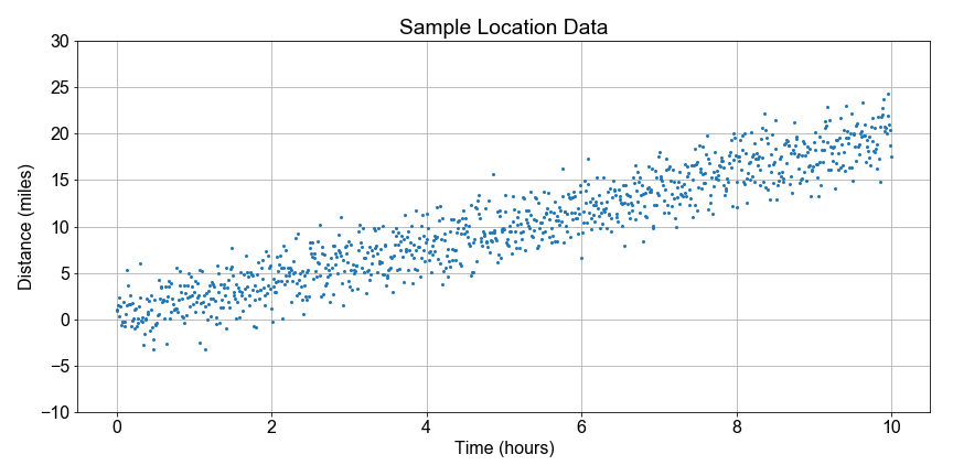
Continuing where we left off earlier in this lesson, let's visualize the bootstrap distribution of speeds estimated using bootstrap resampling, where we computed a least-squares fit to the slope for every sample to test the variation or uncertainty in our slope estimation.
To get you started, we've preloaded a function compute_resample_speeds(distances, times) to do the computation of generate the speed sample distribution.
This exercise is part of the course
Introduction to Linear Modeling in Python
Exercise instructions
- Use the pre-defined
compute_resample_speeds(distances, times)to compute theresample_speeds. - Use
np.mean()to compute thespeed_estimatefrom theresample_speeds. - Use
np.percentile()with[5, 95]to compute thepercentilesofresample_speeds, which define the confidence interval boundaries. - Use
axis.hist()to plot theresample_speeds, specifying the bins withhist_bin_edges. - Using
axis.axvline, specify the correct two indices ofpercentilesto mark the confidence interval boundaries on the chart.
Hands-on interactive exercise
Have a go at this exercise by completing this sample code.
# Create the bootstrap distribution of speeds
resample_speeds = compute_resample_speeds(____, ____)
speed_estimate = np.mean(____)
percentiles = np.percentile(____, [5, 95])

# Plot the histogram with the estimate and confidence interval
fig, axis = plt.subplots()
hist_bin_edges = np.linspace(0.0, 4.0, 21)
axis.hist(____, ____, color='green', alpha=0.35, rwidth=0.8)
axis.axvline(speed_estimate, label='Estimate', color='black')
axis.axvline(percentiles[____], label=' 5th', color='blue')
axis.axvline(percentiles[____], label='95th', color='blue')
axis.legend()
plt.show()