製作分面網格圖
在上一個練習中,你撰寫了以下程式碼:
# Subset tech and fmcg companies
subset_dat = dataset.loc[dataset["comp_type"].isin(["tech", "fmcg"])]

# Compute yearly average gross margin ratio of tech and fmcg companies
subset_dat_avg = subset_dat.pivot_table(index=["Year", "comp_type"], values = "gross_margin").reset_index()

#Add column company
subset_dat_avg["company"] = np.where(subset_dat_avg["comp_type"]=="tech", "Avg tech", "Avg fmcg")

#Concat the DataFrames
plot_df = pd.concat([subset_dat, subset_dat_avg], axis=0)
這段程式碼已為你準備好資料,用來製作下列圖表:
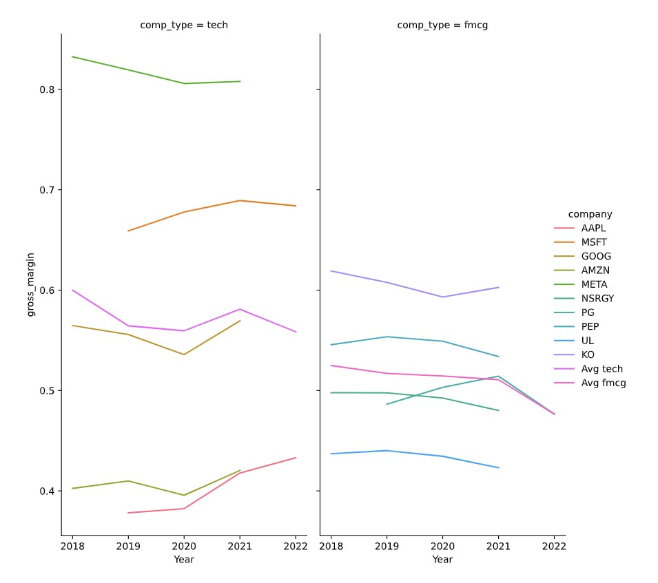
現在該動手繪製圖表了。
本練習屬於課程
使用 Python 分析財務報表
練習說明
- 使用 DataFrame
plot_df,搭配seaborn,繪製說明中提到的分面網格圖。
動手互動練習
試著完成這個範例程式碼,體驗一下這個練習。
# Make the plot
sns.relplot(data=plot_df.reset_index(drop=True), ____)
plt.show()
plt.close()