Yayılımı ölçmek için kutu grafikleri
Veri görselleştirme, çeyrekler arası aralık (IQR) gibi yayılım ölçülerini vurgulamak için faydalı olabilir.
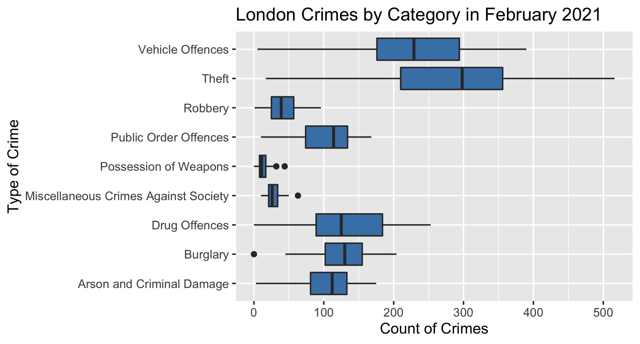
Aşağıda, Şubat 2021'de tüm London Boroughs genelinde, suç türüne göre gruplanmış suç sayısını gösteren bir kutu grafiği yer alıyor.
Görevin, bu ay için hangi suç türünün en büyük çeyrekler arası aralığa sahip olduğunu grafikten belirlemek.
Bu egzersiz
İstatistiklere Giriş
kursunun bir parçasıdırUygulamalı interaktif egzersiz
İnteraktif egzersizlerimizden biriyle teoriyi pratiğe dökün
 Egzersizi başlat