Boxplots om spreiding te meten
Datavisualisatie kan helpen om maten van spreiding te benadrukken, zoals het interkwartielbereik (IQR).
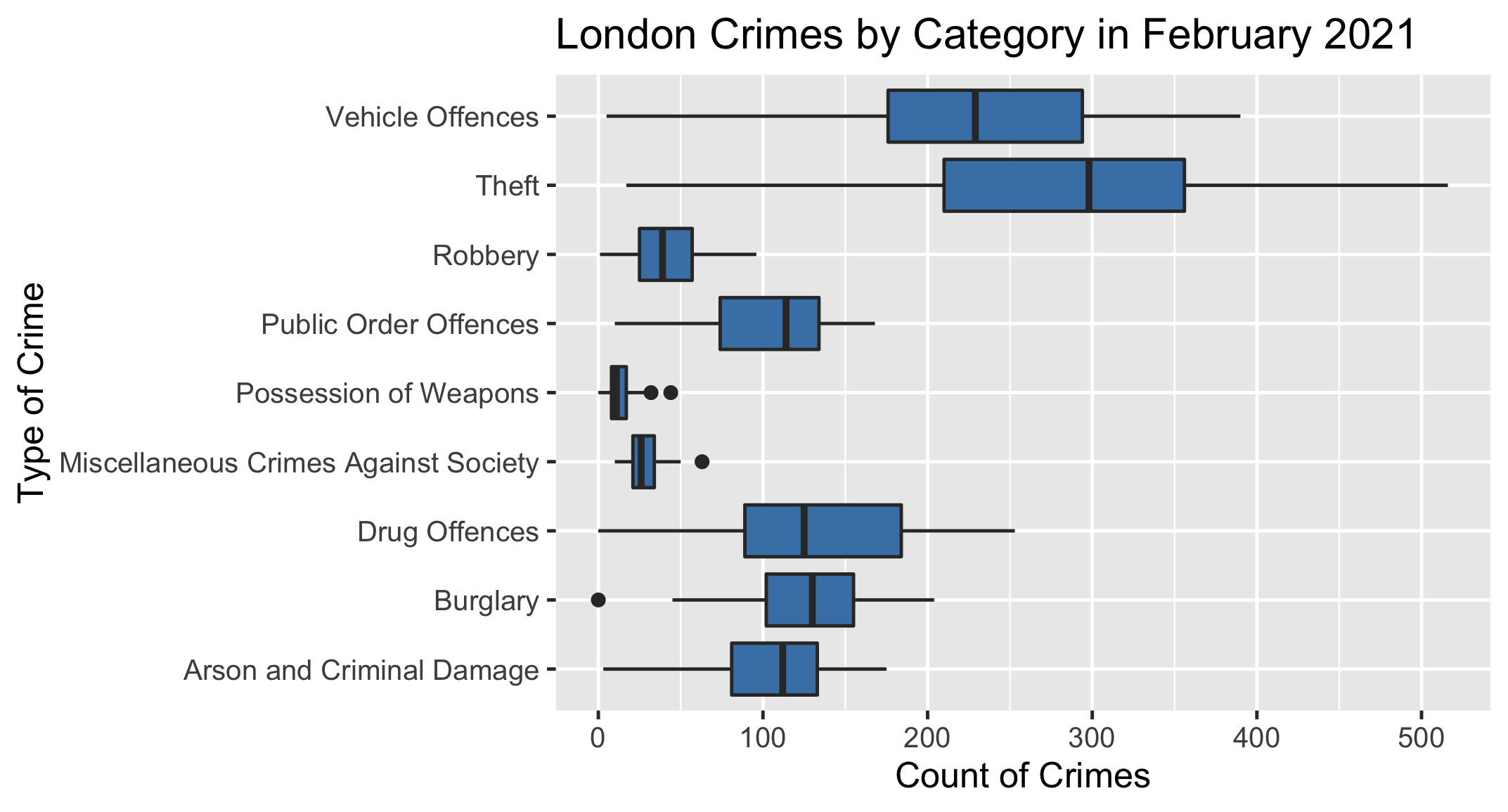
Hieronder staat een boxplot met het aantal misdrijven in alle Londense boroughs in februari 2021, gegroepeerd naar type misdrijf.
Jouw taak is om met behulp van de plot te bepalen welk type misdrijf in deze maand het grootste interkwartielbereik had.
Deze oefening maakt deel uit van de cursus
Inleiding tot statistiek
Praktische interactieve oefening
Zet theorie om in actie met een van onze interactieve oefeningen.
 Begin met trainen