Menafsirkan scatter plot
Scatter plot memungkinkan Anda mengeksplorasi hubungan antara dua variabel kontinu.
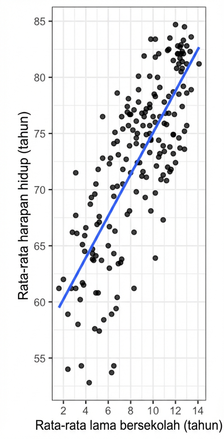
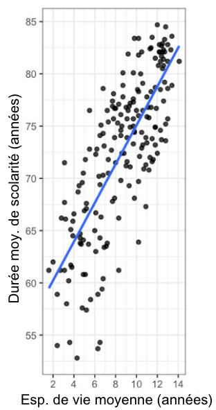
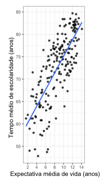
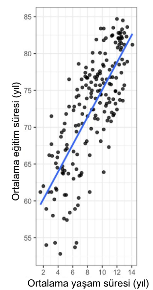
Di sini Anda dapat melihat scatter plot harapan hidup rata-rata (pada sumbu y) dibandingkan dengan rata-rata lama sekolah (pada sumbu x) untuk negara-negara di seluruh dunia. Setiap titik pada plot mewakili satu negara. Garis tren lurus dari model regresi linear ditampilkan.
Lihat versi terjemahan: IT | DE | ES | FR | PT-BR | TR
Sumber data: United Nations
Latihan ini merupakan bagian dari kursus
Memahami Visualisasi Data
Latihan interaktif langsung
Ubah teori menjadi aksi dengan salah satu latihan interaktif kami
 Mulai latihan