Menafsirkan histogram
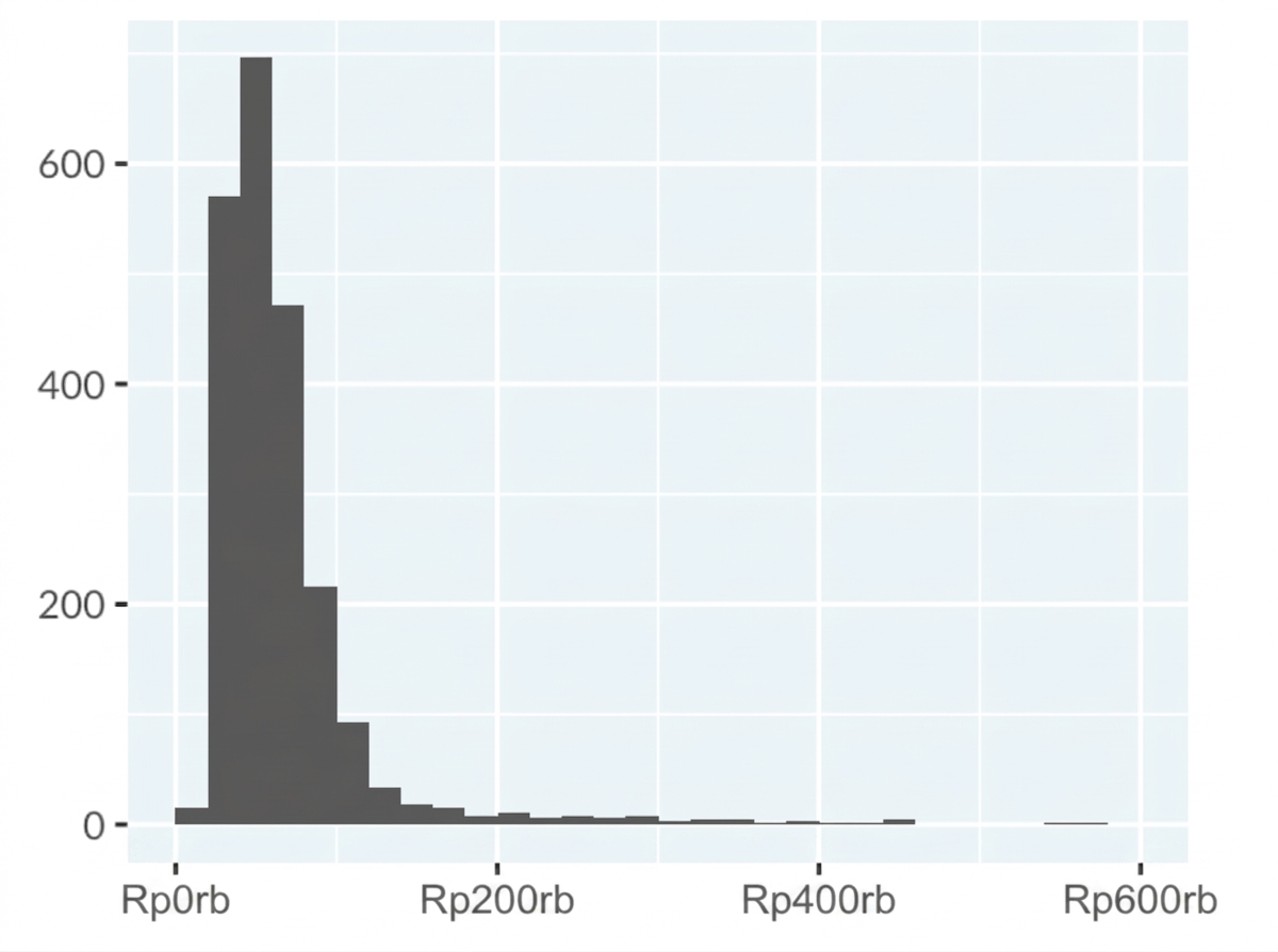
Histogram di bawah ini menampilkan distribusi rata-rata penghasilan kena pajak untuk berbagai pekerjaan di Australia. Sumbu-x merepresentasikan rata-rata penghasilan kena pajak (AUD/tahun), yang menunjukkan rentang gaji. Sumbu-y merepresentasikan jumlah pekerjaan di setiap rentang penghasilan.
Tip: Panel kiri latihan ini yang berisi teks dan instruksi dapat diubah ukurannya. Jika plot terlalu kecil untuk dilihat jelas, memperlebar panel akan memperbesar ukuran plot. Arahkan kursor ke antara panel kiri dan bagian seret-dan-lepas pada latihan hingga muncul batang vertikal abu-abu. Di Chrome, klik dan seret batang ini ke kanan. Di Firefox, klik batangnya, gerakkan kursor ke kanan, lalu klik lagi.
Sumber Data: Tidy Tuesday
Latihan ini merupakan bagian dari kursus
Memahami Visualisasi Data
Latihan interaktif langsung
Ubah teori menjadi aksi dengan salah satu latihan interaktif kami
 Mulai latihan