रंग से किस वैरिएबल को एन्कोड करें: सही चुनाव
आपको समय के साथ Long Beach और आस-पास के शहरों के प्रदूषण मानों का विज़ुअलाइज़ेशन बनाना है. दिए गए कोड से नीचे दिखाया गया (पढ़ने में मुश्किल) प्लॉट बनता है, जिसमें अधिकतम प्रदूषण मान (max_pollutant_values) हैं और बार्स को शहर के अनुसार रंगा गया है.
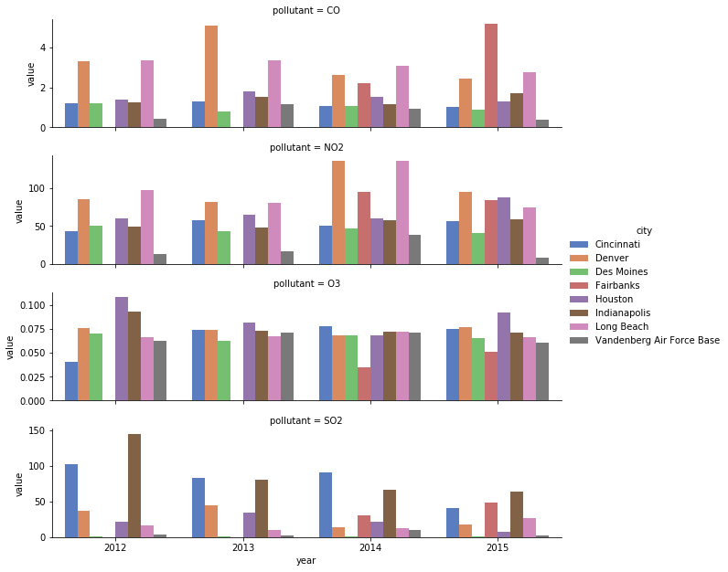
आप कुछ छोटे बदलावों से इसे जल्दी बेहतर बना सकते हैं. केवल देश के पश्चिमी हिस्से के शहर दिखाने के लिए फ़िल्टर करने से अव्यवस्था कम होगी. अगला कदम, रंग-एन्कोडिंग को city से बदलकर year करना है, जिससे आप एक ordinal पैलेट इस्तेमाल कर पाएँगे और पाठक को यह देखने के लिए बार-बार legend पर निर्भर नहीं होना पड़ेगा कि कौन-सा रंग किस शहर से संबंधित है.
यह अभ्यास पाठ्यक्रम का हिस्सा है
Python में अपनी डेटा विज़ुअलाइज़ेशन बेहतर करें
अभ्यास निर्देश
citiesवेक्टर से'Indianapolis','Des Moines','Cincinnati','Houston'हटा दें.cityऔरyearवैरिएबल की एन्कोडिंग को आपस में बदलें.- नए ordinal वैरिएबल के लिए रंगों को ठीक से मैप करने के लिए
'BuGn'ColorBrewer पैलेट का उपयोग करें.
इंटरैक्टिव व्यावहारिक अभ्यास
इस अभ्यास को इस नमूना कोड को पूरा करके आज़माएँ।
# Reduce to just cities in the western half of US
cities = ['Fairbanks', 'Long Beach', 'Vandenberg Air Force Base', 'Denver',
          'Indianapolis', 'Des Moines', 'Cincinnati', 'Houston']

# Filter data to desired cities
city_maxes = max_pollutant_values[max_pollutant_values.city.isin(cities)]

# Swap city and year encodings
sns.catplot(x = 'year', hue = 'city',
              y = 'value', row = 'pollutant',
              # Change palette to one appropriate for ordinal categories
              data = city_maxes, palette = 'muted',
              sharey = False, kind = 'bar')
plt.show()