Corriger les diagrammes en barres de Seaborn
Les valeurs par défaut de Seaborn pour la couleur des barres d’un diagramme en barres ne sont pas idéales pour une perception fidèle. En colorant chaque barre différemment, on risque que le public perçoive deux barres de même taille comme différentes, car certaines couleurs paraissent « plus grandes » que d’autres.
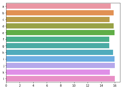
Nous avons vu deux moyens simples de corriger cela. Premier moyen : ajouter une bordure autour des barres ; second : donner la même couleur à toutes les barres. Essayez ces deux solutions sur nos données de pollution.
Cet exercice fait partie du cours
<cours>Améliorer vos visualisations de données en Python</cours>Exercice interactif pratique
Essayez cet exercice en complétant ce code d’exemple.
import numpy as np

sns.barplot(y = 'city', x = 'CO',
            estimator = np.mean,
            ci = False,
            data = pollution,
            # Add a border to the bars
            ____ = ____)
plt.show()