Tab-Layouts
Mehrere Tabellen und Diagramme auf derselben Seite anzuzeigen, kann zu visueller Unübersichtlichkeit führen und Nutzerinnen und Nutzer der App ablenken. In solchen Fällen ist das Tab-Layout praktisch, da es ermöglicht, verschiedene Ausgaben als Tabs darzustellen.
In dieser Übung starten wir mit der Shiny-App mit Sidebar-Layout aus der letzten Aufgabe und passen sie so an, dass Tabs verwendet werden. Diese Übung zeigt dir außerdem, wie einfach es in Shiny ist, App-Layouts mit nur wenigen Code-Änderungen zu wechseln.
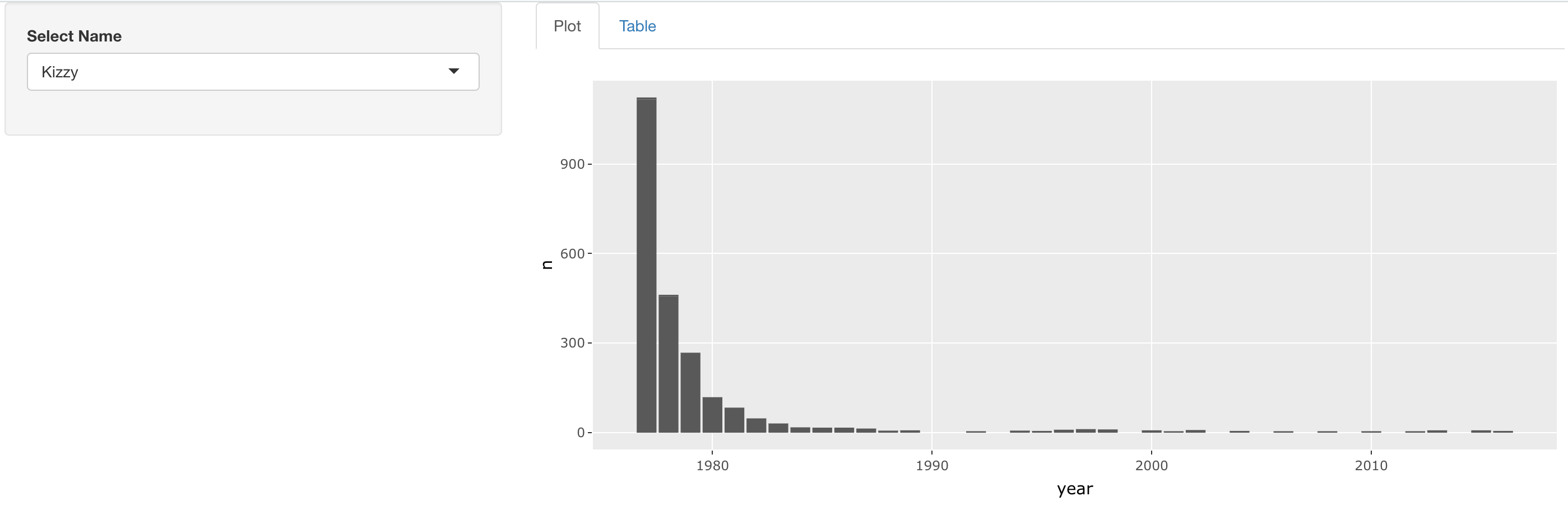
Deine finale App sollte ungefähr so aussehen:
Diese Übung ist Teil des Kurses
<Kurs>Webanwendungen mit Shiny in R entwickeln</Kurs>Übungsanweisungen
- Ändere das Layout dieser App so, dass der Namenswähler in der Sidebar erscheint und Diagramm sowie Tabelle rechts im Hauptbereich als getrennte Tabs angezeigt werden. Vergiss nicht, die Tabs zu beschriften!
Interaktive praktische Übung
Versuche dich an dieser Übung, indem du diesen Beispielcode vervollständigst.
ui <- fluidPage(
  sidebarLayout(
    sidebarPanel(
      selectInput('name', 'Select Name', top_trendy_names$name)
    ),
    mainPanel(
      # MODIFY CODE BLOCK BELOW: Wrap in a tabsetPanel
        # MODIFY CODE BELOW: Wrap in a tabPanel providing an appropriate label
        plotly::plotlyOutput('plot_trendy_names'),
        # MODIFY CODE BELOW: Wrap in a tabPanel providing an appropriate label
        DT::DTOutput('table_trendy_names')
    )
  )
)

server <- function(input, output, session){
  # Function to plot trends in a name
  plot_trends <- function(){
     babynames %>%
      filter(name == input$name) %>%
      ggplot(aes(x = year, y = n)) +
      geom_col()
  }
  output$plot_trendy_names <- plotly::renderPlotly({
    plot_trends()
  })

  output$table_trendy_names <- DT::renderDT({
    babynames %>%
      filter(name == input$name)
  })
}

shinyApp(ui = ui, server = server)