Vẽ biểu đồ facet grid
Trong bài trước, bạn đã viết đoạn mã sau:
# Subset tech and fmcg companies
subset_dat = dataset.loc[dataset["comp_type"].isin(["tech", "fmcg"])]

# Compute yearly average gross margin ratio of tech and fmcg companies
subset_dat_avg = subset_dat.pivot_table(index=["Year", "comp_type"], values = "gross_margin").reset_index()

#Add column company
subset_dat_avg["company"] = np.where(subset_dat_avg["comp_type"]=="tech", "Avg tech", "Avg fmcg")

#Concat the DataFrames
plot_df = pd.concat([subset_dat, subset_dat_avg], axis=0)
Đoạn mã này đã chuẩn bị dữ liệu để tạo biểu đồ sau:
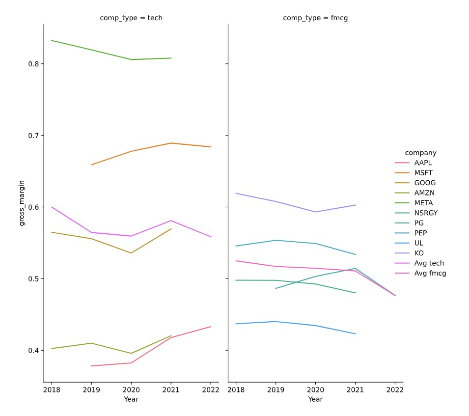
Bây giờ đến lúc bạn tạo biểu đồ.
Bài tập này là một phần của khóa học
Phân tích báo cáo tài chính bằng Python
Hướng dẫn bài tập
- Dùng DataFrame
plot_dfđể vẽ biểu đồ facet grid như mô tả bằngseaborn.
Bài tập tương tác thực hành trực tiếp
Hãy thử làm bài tập này bằng cách hoàn thành đoạn mã mẫu này.
# Make the plot
sns.relplot(data=plot_df.reset_index(drop=True), ____)
plt.show()
plt.close()