Een aangepast continu palet maken
Je bent geïnteresseerd in de vervuilingsniveaus in Cincinnati in 2014. Je focust specifiek op CO en NO2, dus je maakt een eenvoudige scatterplot om de relatie tussen deze twee stoffen te laten zien.
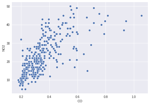
Er kan echter interessante informatie zitten in hoe de waarde van O3 zich verhoudt tot de twee geplotte stoffen, dus je besluit de punten te kleuren op basis van hun O3-niveau. Hiervoor moet je een passend continu palet definiëren en je O3-kolom hieraan koppelen in je scatterplot.
Deze oefening maakt deel uit van de cursus
Je datavisualisaties verbeteren in Python
Oefeninstructies
- Maak een palet dat continu loopt van wit naar
'orangered'. - Koppel de kolom met
O3-waarden aan de kleur van de punten. - Geef je gemaakte palet door aan de plotfunctie.
Interactieve oefening met praktijkervaring
Probeer deze oefening door deze voorbeeldcode aan te vullen.
# Filter the data
cinci_2014 = pollution.query("city  ==  'Cincinnati' & year  ==  2014")

# Define a custom continuous color palette
color_palette = sns.____('orangered',
                         ____ = True)

# Plot mapping the color of the points with custom palette
sns.scatterplot(x = 'CO',
                y = 'NO2',
                ____ = 'O3',
                data = cinci_2014,
                palette = ____)
plt.show()