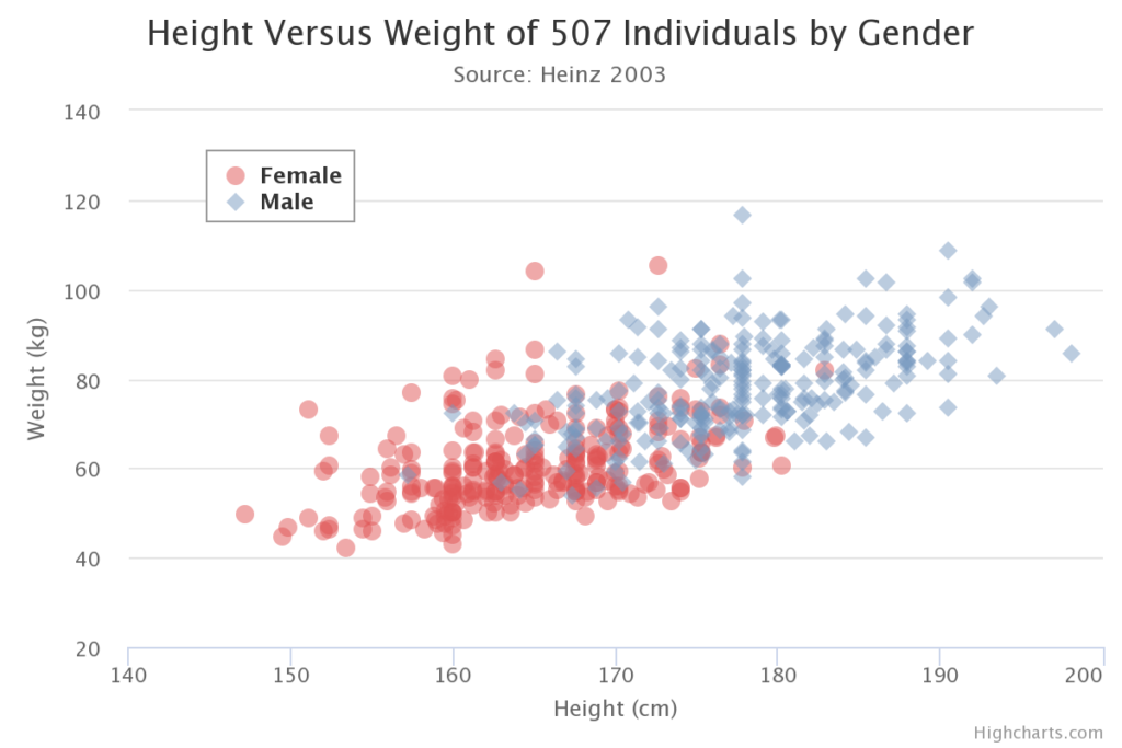
Oefen met het interpreteren van een scatterplot
Hoe zou je de richting en sterkte van de relatie beschrijven, zoals gevisualiseerd in de scatterplot?
Deze oefening maakt deel uit van de cursus
Exploratory Data Analysis in Power BI
Interactieve oefening met praktijkervaring
Zet theorie om in actie met een van onze interactieve oefeningen
 Begin oefening