탭 레이아웃
한 페이지에 여러 개의 표와 그래프를 동시에 보여 주면 화면이 복잡해져서 앱 사용자가 집중하기 어려울 수 있어요. 이런 경우에는 탭 레이아웃이 유용합니다. 서로 다른 결과물을 탭으로 나눠 깔끔하게 표시할 수 있기 때문이에요.
이번 연습에서는 이전 연습에서 사용한 사이드바 레이아웃의 Shiny 앱을 시작점으로 삼아, 탭을 사용하도록 수정해 보겠습니다. 이 연습을 통해 코드 몇 줄만 바꾸면 Shiny에서 앱 레이아웃을 아주 쉽게 전환할 수 있다는 점도 분명해질 거예요.
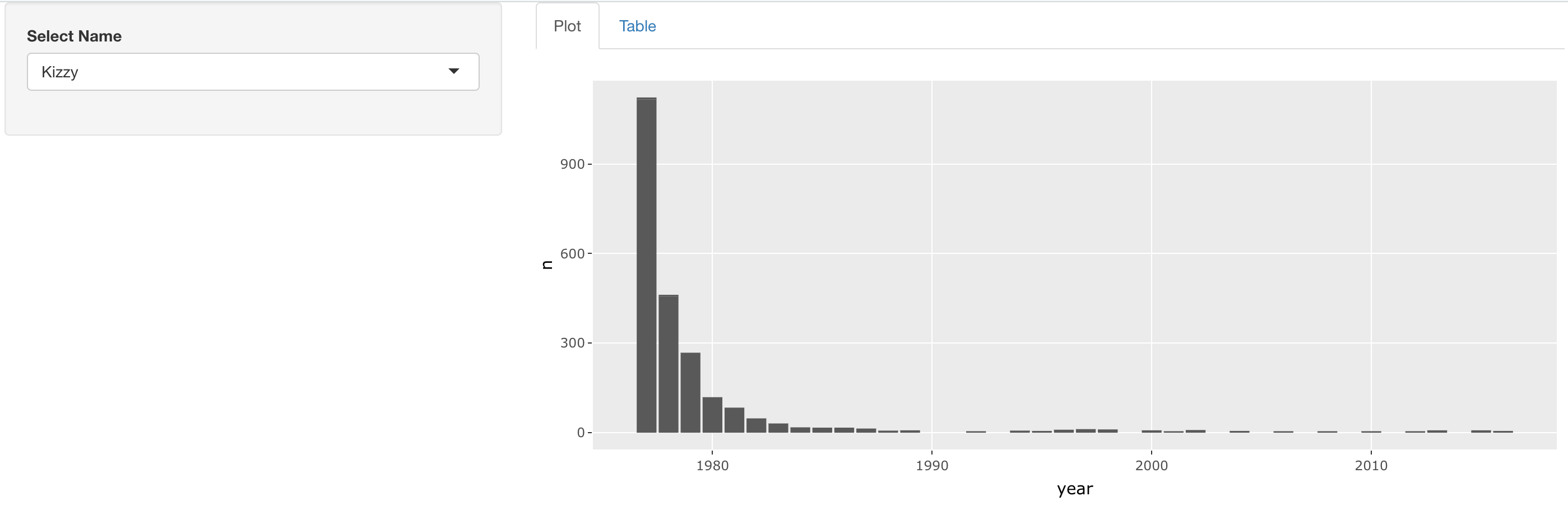
완성된 앱은 다음과 비슷하게 보이면 됩니다:
이 연습은 강의의 일부입니다
R로 Shiny 웹 애플리케이션 만들기
연습 안내
- 이 앱의 레이아웃을 수정해서 이름 선택기는 사이드바에 두고, 오른쪽 메인 패널에는 그래프와 표가 각각 별도의 탭으로 보이도록 하세요. 탭에 레이블 붙이는 것도 잊지 마세요!
실습형 인터랙티브 연습
이 예제를 이 샘플 코드를 완성하여 풀어보세요.
ui <- fluidPage(
  sidebarLayout(
    sidebarPanel(
      selectInput('name', 'Select Name', top_trendy_names$name)
    ),
    mainPanel(
      # MODIFY CODE BLOCK BELOW: Wrap in a tabsetPanel
        # MODIFY CODE BELOW: Wrap in a tabPanel providing an appropriate label
        plotly::plotlyOutput('plot_trendy_names'),
        # MODIFY CODE BELOW: Wrap in a tabPanel providing an appropriate label
        DT::DTOutput('table_trendy_names')
    )
  )
)

server <- function(input, output, session){
  # Function to plot trends in a name
  plot_trends <- function(){
     babynames %>%
      filter(name == input$name) %>%
      ggplot(aes(x = year, y = n)) +
      geom_col()
  }
  output$plot_trendy_names <- plotly::renderPlotly({
    plot_trends()
  })

  output$table_trendy_names <- DT::renderDT({
    babynames %>%
      filter(name == input$name)
  })
}

shinyApp(ui = ui, server = server)