Box plot per misurare la dispersione
La visualizzazione dei dati può essere utile per mettere in evidenza le misure di dispersione, come l'intervallo interquartile (IQR).
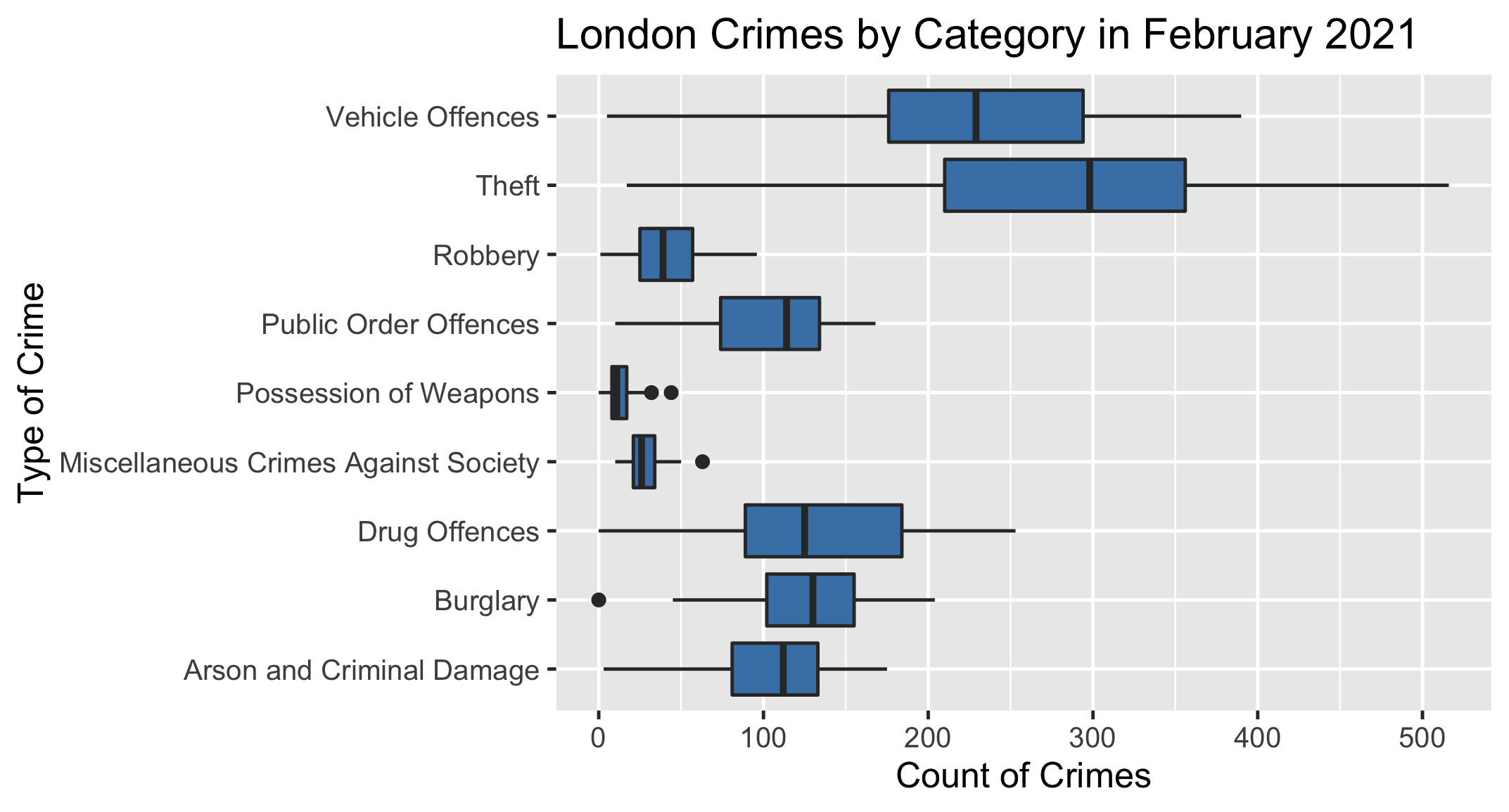
Di seguito trovi un box plot che mostra il numero di crimini in tutti i borough di Londra nel febbraio 2021, raggruppati per tipologia di reato.
Il tuo compito è usare il grafico per determinare quale tipologia di reato ha avuto l'intervallo interquartile più ampio in questo mese.
Questo esercizio fa parte del corso
Introduzione alla statistica
Esercizio pratico interattivo
Passa dalla teoria alla pratica con uno dei nostri esercizi interattivi
 Inizia esercizio