Cosa può dirti la correlazione?
Nell’ultimo esercizio, hai visto una relazione negativa da debole a moderata tra il costo di una bottiglia d’acqua e il numero di ore lavorate all’anno in diverse città. Ecco il grafico come promemoria:
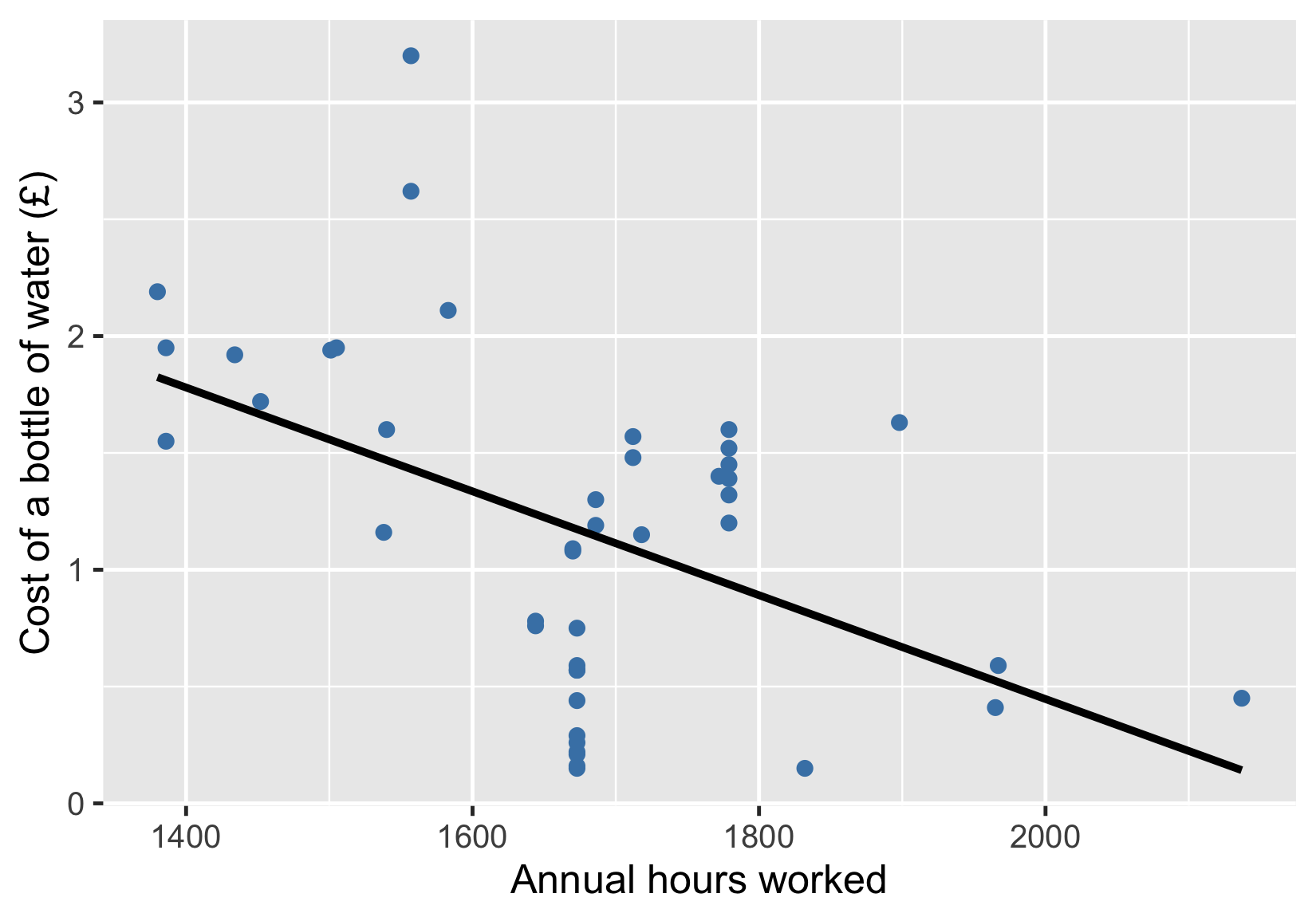
Il tuo compito è scegliere l’affermazione che descrive in modo accurato ciò che puoi ragionevolmente concludere da questa visualizzazione.
Questo esercizio fa parte del corso
Introduzione alla statistica
esercizio interattivo pratico
Trasforma la teoria in pratica con uno dei nostri esercizi interattivi
 Inizia esercizio