Creare un facet grid plot
Nell’esercizio precedente, hai scritto il seguente codice:
# Subset tech and fmcg companies
subset_dat = dataset.loc[dataset["comp_type"].isin(["tech", "fmcg"])]

# Compute yearly average gross margin ratio of tech and fmcg companies
subset_dat_avg = subset_dat.pivot_table(index=["Year", "comp_type"], values = "gross_margin").reset_index()

#Add column company
subset_dat_avg["company"] = np.where(subset_dat_avg["comp_type"]=="tech", "Avg tech", "Avg fmcg")

#Concat the DataFrames
plot_df = pd.concat([subset_dat, subset_dat_avg], axis=0)
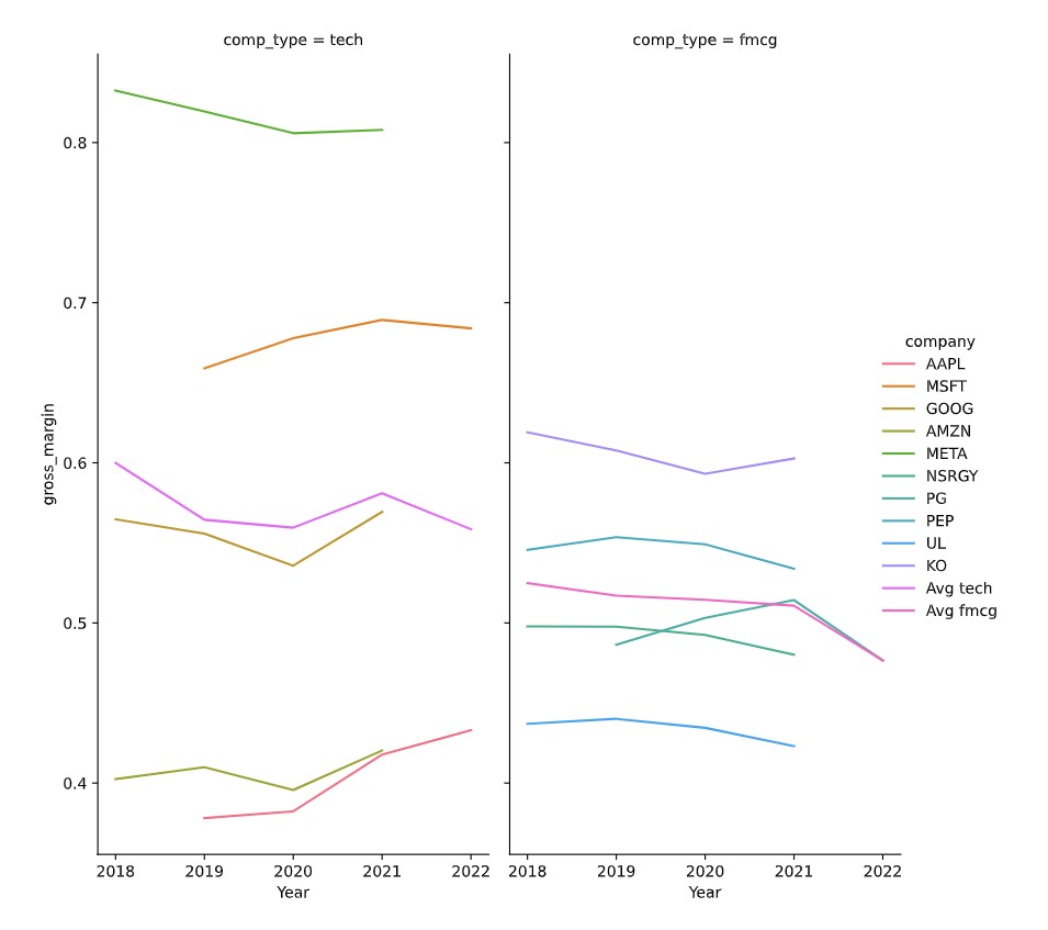
Questo codice ha preparato i dati per creare il seguente grafico:
Ora è il momento di creare il grafico.
Questo esercizio fa parte del corso
Analizzare i bilanci con Python
Istruzioni dell'esercizio
- Usa il DataFrame
plot_dfper creare il facet grid plot descritto utilizzandoseaborn.
esercizio interattivo pratico
Prova questo esercizio completando questo codice di esempio.
# Make the plot
sns.relplot(data=plot_df.reset_index(drop=True), ____)
plt.show()
plt.close()