Eine eigene kontinuierliche Palette erstellen
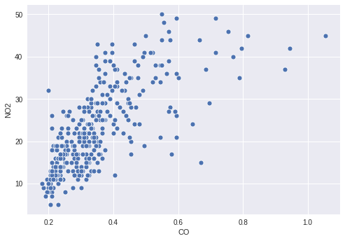
Du interessierst dich für die Luftverschmutzung in Cincinnati im Jahr 2014. Konkret schaust du dir CO und NO2 an und erstellst dazu ein einfaches Streudiagramm, um die Beziehung zwischen den beiden Schadstoffen zu zeigen.
Es könnte aber spannend sein zu sehen, wie der Wert von O3 mit den beiden dargestellten Schadstoffen zusammenhängt. Deshalb färbst du die Punkte nach ihren O3-Werten ein. Dafür musst du eine passende kontinuierliche Palette definieren und deine Spalte O3 im Streudiagramm darauf abbilden.
Diese Übung ist Teil des Kurses
<Kurs>So verbesserst du deine Datenvisualisierungen in Python</Kurs>Übungsanweisungen
- Erstelle eine Palette, die kontinuierlich von Weiß bis
'orangered'abbildet. - Weise die Spalte mit den
O3-Werten der Farbe der Punkte zu. - Übergib die erstellte Palette an die Plot-Funktion.
Interaktive praktische Übung
Versuche dich an dieser Übung, indem du diesen Beispielcode vervollständigst.
# Filter the data
cinci_2014 = pollution.query("city  ==  'Cincinnati' & year  ==  2014")

# Define a custom continuous color palette
color_palette = sns.____('orangered',
                         ____ = True)

# Plot mapping the color of the points with custom palette
sns.scatterplot(x = 'CO',
                y = 'NO2',
                ____ = 'O3',
                data = cinci_2014,
                palette = ____)
plt.show()