Farbe einsetzen
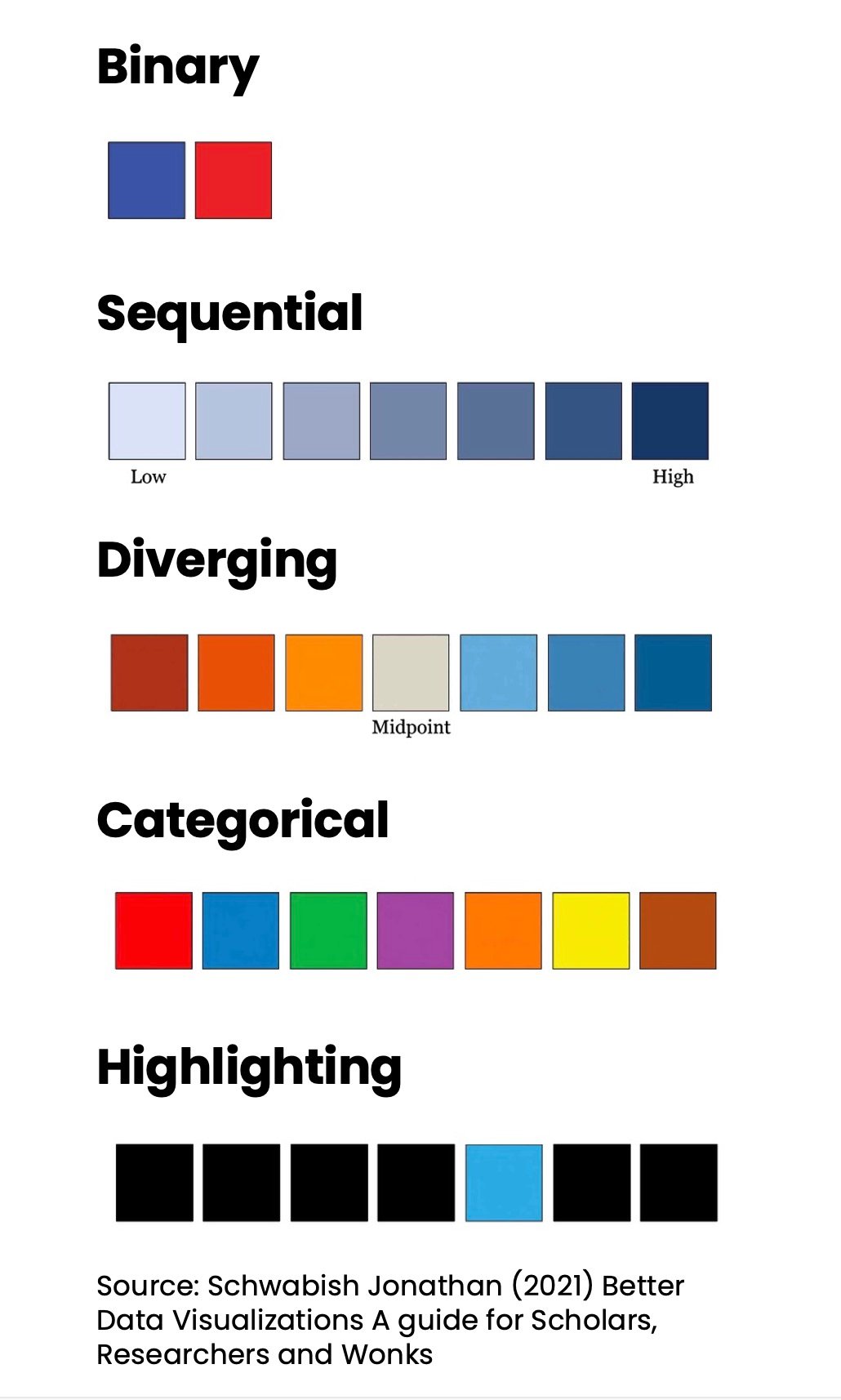
Farbe gehört zu den am häufigsten genutzten Merkmalen in der Datenvisualisierung.
Es ist kein Zufall, dass viele Organisationen Handbücher mit Standards zur Farbnutzung haben – um ihrer Markenidentität treu zu bleiben und aus Gründen der Barrierefreiheit.
Fünf grundlegende Farbschemata lassen sich auf deine Visualisierungen anwenden:
Diese Übung ist Teil des Kurses
<Kurs>Fallstudie Data Storytelling: Grüne Unternehmen</Kurs>Interaktive praktische Übung
Verwandle Theorie mit einer unserer interaktiven Übungen in die Praxis
 Übung starten