Box plots for measuring spread
Data visualization can be useful in highlighting measures of spread, such as the interquartile range (IQR).
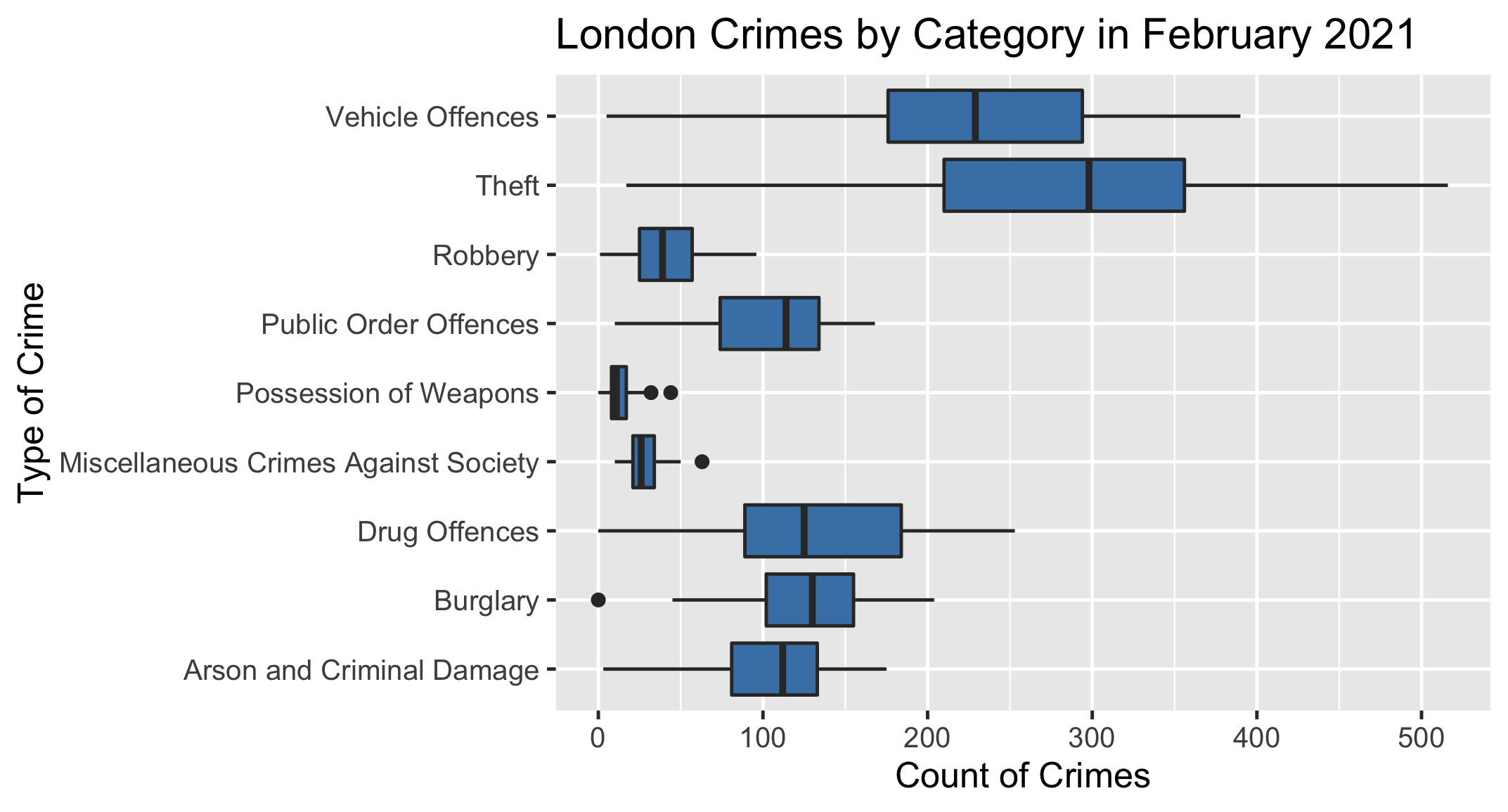
Below is a box plot displaying the number of crimes across all London Boroughs in February 2021, grouped by the type of crime.
Your task is to use the plot to determine which type of crime had the largest interquartile range for this month.
This exercise is part of the course
Introduction to Statistics
Hands-on interactive exercise
Turn theory into action with one of our interactive exercises
 Start Exercise