What can correlation tell you?
In the last exercise, you saw a weak-to-moderate negative relationship between the cost of a bottle of water and the number of hours worked annually in different cities. Here is the plot as a reminder:
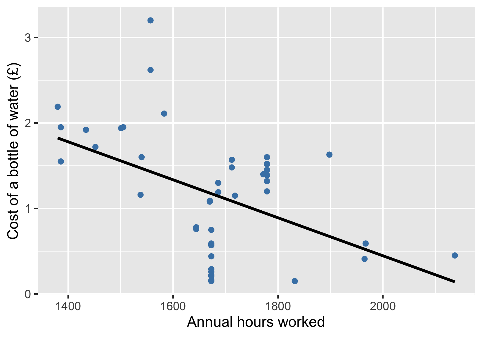
Your task is to choose the statement that accurately describes what you can reasonably conclude from this visualization.
This exercise is part of the course
Introduction to Statistics
Hands-on interactive exercise
Turn theory into action with one of our interactive exercises
 Start Exercise