Use of color
Color is one of the most used attributes in data visualization.
It's no coincidence that many organizations have manuals regarding standards to use color to adhere to their own branding, as well as accessibility reasons.
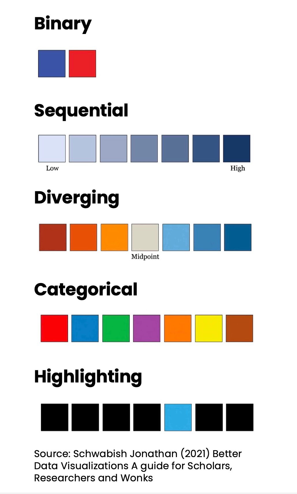
Five main color schemes can be applied to your data visualizations:
แบบฝึกหัดนี้เป็นส่วนหนึ่งของหลักสูตร
Data Storytelling Case Study: Green Businesses
แบบฝึกหัดเชิงโต้ตอบแบบลงมือทำจริง
เปลี่ยนทฤษฎีให้เป็นการลงมือทำด้วยแบบฝึกหัดเชิงโต้ตอบหนึ่งในของเรา
 เริ่มแบบฝึกหัด