Campagneprestaties ontrafelen
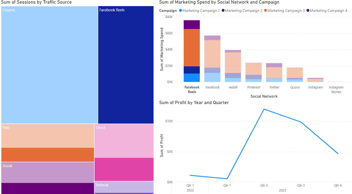
Tijd voor campagne-analyse! Stel, je hebt een boomkaart gemaakt (sessies per verkeersbron), een staafdiagram (marketinguitgaven per kanaal) en een lijngrafiek (winst). De standaardweergave van je rapporttab staat hieronder.
Laten we deze Power BI-visuals gebruiken om de meest winstgevende campagne te ontleden en optimalisatiekansen te vinden.
Deze oefening maakt deel uit van de cursus
Power BI voor eindgebruikers
Interactieve oefening met praktijkervaring
Zet theorie om in actie met een van onze interactieve oefeningen
 Begin oefening