Misleidend nieuws?
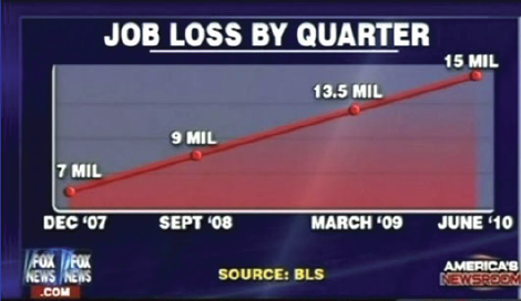
Goedenavond; dit is je dagelijkse nieuwsupdate. Vandaag brengen we een zorgwekkend bericht over het toenemende aantal ontslagen, waardoor veel mensen en gezinnen met een onzekere toekomst zitten. Laten we de gegevens van dichterbij bekijken..
Bron: https://www.businessinsider.com/the-27-worst-charts-of-all-time-2013-6
Als ambitieuze expert in datavisualisatie zie je ongetwijfeld meerdere problemen met deze grafiek. Afgezien van de vrij evidente opmaakfoutjes is deze grafiek vooral erg misleidend.
Kun je aangeven waarom dit misleidend is?
Deze oefening maakt deel uit van de cursus
Gegevens visualiseren in Excel
Interactieve oefening met praktijkervaring
Zet theorie om in actie met een van onze interactieve oefeningen
 Begin oefening