Een facetgrid-plot maken
In de vorige oefening schreef je de volgende code:
# Subset tech and fmcg companies
subset_dat = dataset.loc[dataset["comp_type"].isin(["tech", "fmcg"])]

# Compute yearly average gross margin ratio of tech and fmcg companies
subset_dat_avg = subset_dat.pivot_table(index=["Year", "comp_type"], values = "gross_margin").reset_index()

#Add column company
subset_dat_avg["company"] = np.where(subset_dat_avg["comp_type"]=="tech", "Avg tech", "Avg fmcg")

#Concat the DataFrames
plot_df = pd.concat([subset_dat, subset_dat_avg], axis=0)
De code heeft de data voorbereid om de volgende plot te maken:
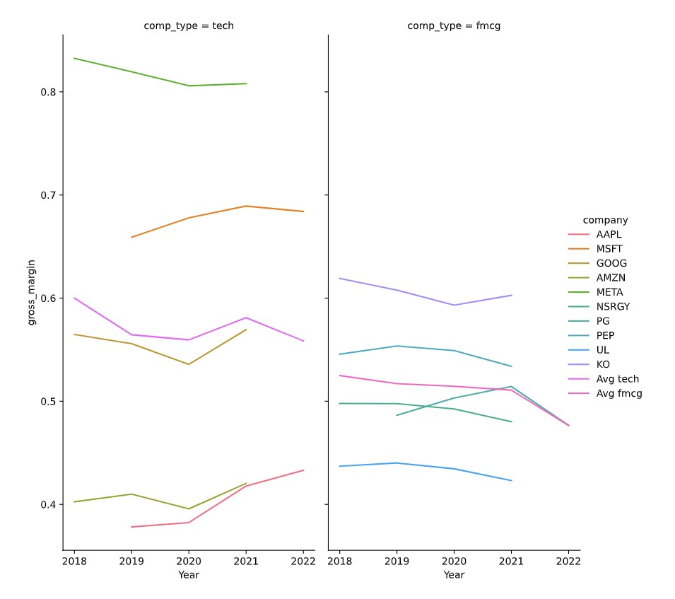
Tijd om de plot te maken.
Deze oefening maakt deel uit van de cursus
Financiële overzichten analyseren in Python
Oefeninstructies
- Gebruik de DataFrame
plot_dfom de facetgrid-plot in de beschrijving te maken metseaborn.
Interactieve oefening met praktijkervaring
Probeer deze oefening door deze voorbeeldcode aan te vullen.
# Make the plot
sns.relplot(data=plot_df.reset_index(drop=True), ____)
plt.show()
plt.close()