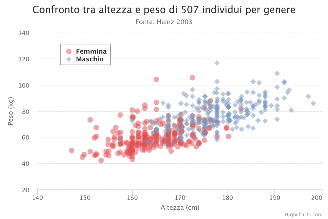
Fai pratica nell’interpretare uno scatter plot
Come descriveresti la direzione e l’intensità della relazione visualizzata dallo scatter plot?
Questo esercizio fa parte del corso
Analisi Esplorativa dei Dati in Power BI
esercizio interattivo pratico
Trasforma la teoria in pratica con uno dei nostri esercizi interattivi
 Inizia esercizio