Box plot untuk mengukur sebaran
Visualisasi data dapat membantu menyoroti ukuran sebaran, seperti rentang interkuartil (IQR).
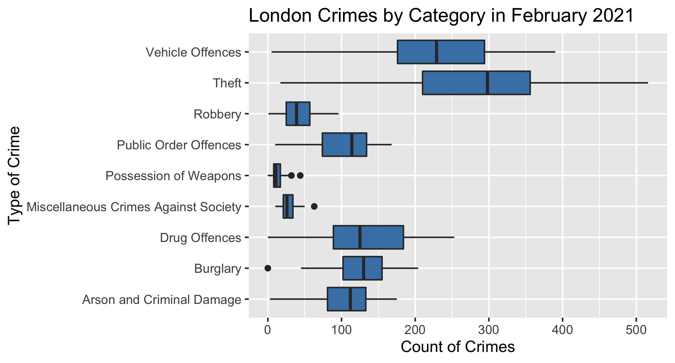
Di bawah ini adalah box plot yang menampilkan jumlah kejahatan di seluruh Borough London pada Februari 2021, dikelompokkan berdasarkan jenis kejahatan.
Tugas Anda adalah menggunakan plot tersebut untuk menentukan jenis kejahatan mana yang memiliki rentang interkuartil terbesar pada bulan ini.
Latihan ini adalah bagian dari kursus
Pengantar Statistika
Latihan interaktif praktis
Ubah teori menjadi tindakan dengan salah satu latihan interaktif kami.
 Mulai berolahraga