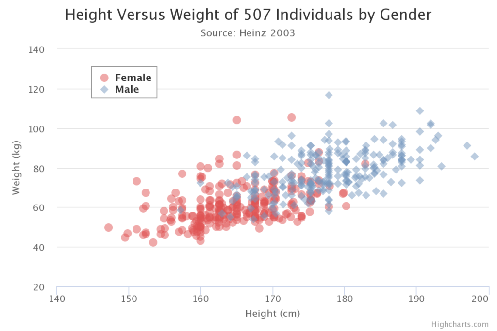
Latihan menafsirkan scatter plot
Bagaimana Anda menggambarkan arah dan kekuatan hubungan yang divisualisasikan oleh scatter plot?
Latihan ini merupakan bagian dari kursus
Analisis Data Eksploratori di Power BI
Latihan interaktif langsung
Ubah teori menjadi aksi dengan salah satu latihan interaktif kami
 Mulai latihan