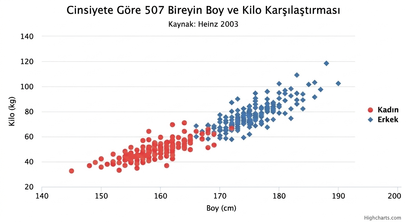
Saçılım grafiğini yorumlama pratiği
Saçılım grafiğinde görselleştirilen ilişkiyi yön ve güç açısından nasıl tanımlarsın?
Bu egzersiz, kursun bir parçasıdır
Power BI ile Keşifsel Veri Analizi
Uygulamalı etkileşimli egzersiz
Teoriyi etkileşime dönüştürün, interaktif egzersizlerimizden biriyle
 Egzersize başla