Aldatıcı haberler mi?
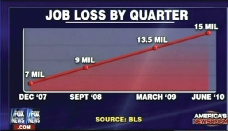
İyi akşamlar; günlük haber bültenine hoş geldin. Bugün, birçok birey ve ailenin belirsiz bir gelecekle karşı karşıya kalmasına yol açan artan iş kayıplarıyla ilgili endişe verici bir haberimiz var. Hadi verilere yakından bakalım..
Kaynak: https://www.businessinsider.com/the-27-worst-charts-of-all-time-2013-6
Gelişmekte olan bir veri görselleştirme uzmanı olarak, bu grafikte birkaç sorun olduğunu kesinlikle fark edebilirsin. Oldukça bariz biçimlendirme kusurlarının ötesinde, bu grafik oldukça yanıltıcı.
Sence neden(leri)yle yanıltıcı?
Bu egzersiz, kursun bir parçasıdır
Excel'de Veri Görselleştirme
Uygulamalı etkileşimli egzersiz
Teoriyi etkileşime dönüştürün, interaktif egzersizlerimizden biriyle
 Egzersize başla