วิเคราะห์ประสิทธิภาพแคมเปญอย่างละเอียด
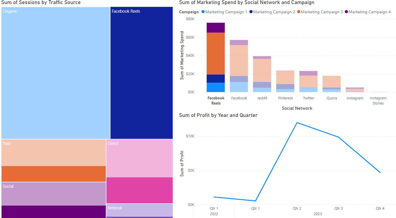
ถึงเวลาวิเคราะห์แคมเปญแล้ว! สมมติว่าคุณสร้าง tree map (จำนวน session ตามแหล่งที่มาของการเข้าชม), แผนภูมิแท่ง (งบการตลาดตามช่องทาง) และกราฟเส้น (กำไร) ไว้แล้ว โดยมุมมองเริ่มต้นของแท็บรายงานจะเป็นดังภาพด้านล่าง
มาใช้ visualization เหล่านี้ใน Power BI เพื่อวิเคราะห์แคมเปญที่ทำกำไรได้มากที่สุด และค้นหาโอกาสในการปรับปรุงกัน
แบบฝึกหัดนี้เป็นส่วนหนึ่งของหลักสูตร
Power BI สำหรับผู้ใช้งานทั่วไป
แบบฝึกหัดเชิงโต้ตอบแบบลงมือทำจริง
เปลี่ยนทฤษฎีให้เป็นการลงมือทำด้วยแบบฝึกหัดเชิงโต้ตอบหนึ่งในของเรา
 เริ่มแบบฝึกหัด