Desvendando o desempenho das campanhas
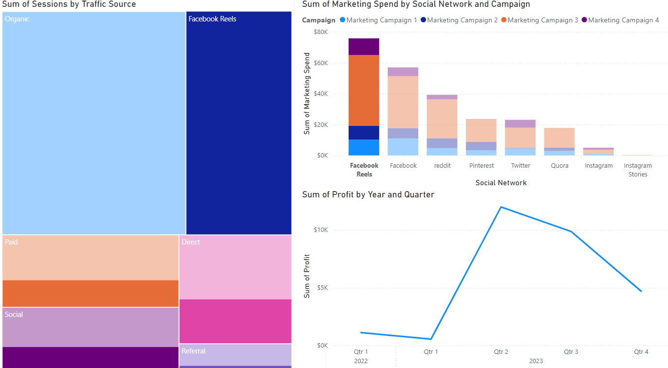
Hora de analisar campanhas! Suponha que você criou um mapa de árvore (sessões por fonte de tráfego), um gráfico de barras (gasto de marketing por canal) e um gráfico de linhas (lucro). A visualização padrão da sua guia de relatório é mostrada abaixo.
Vamos usar essas visualizações do Power BI para dissecar a campanha mais lucrativa e identificar oportunidades de otimização.
Este exercicio faz parte do curso
Power BI para Usuários Finais
exercicio interativo prático
Transforme teoria em prática com um dos nossos exercicio interativos
 Iniciar exercicio