Membuat facet grid plot
Pada latihan sebelumnya, Anda menulis kode berikut:
# Subset perusahaan tech dan fmcg
subset_dat = dataset.loc[dataset["comp_type"].isin(["tech", "fmcg"])]

# Hitung rata-rata tahunan gross margin perusahaan tech dan fmcg
subset_dat_avg = subset_dat.pivot_table(index=["Year", "comp_type"], values = "gross_margin").reset_index()

# Tambahkan kolom company
subset_dat_avg["company"] = np.where(subset_dat_avg["comp_type"]=="tech", "Avg tech", "Avg fmcg")

# Gabungkan DataFrame
plot_df = pd.concat([subset_dat, subset_dat_avg], axis=0)
Kode tersebut menyiapkan data untuk membuat plot berikut:
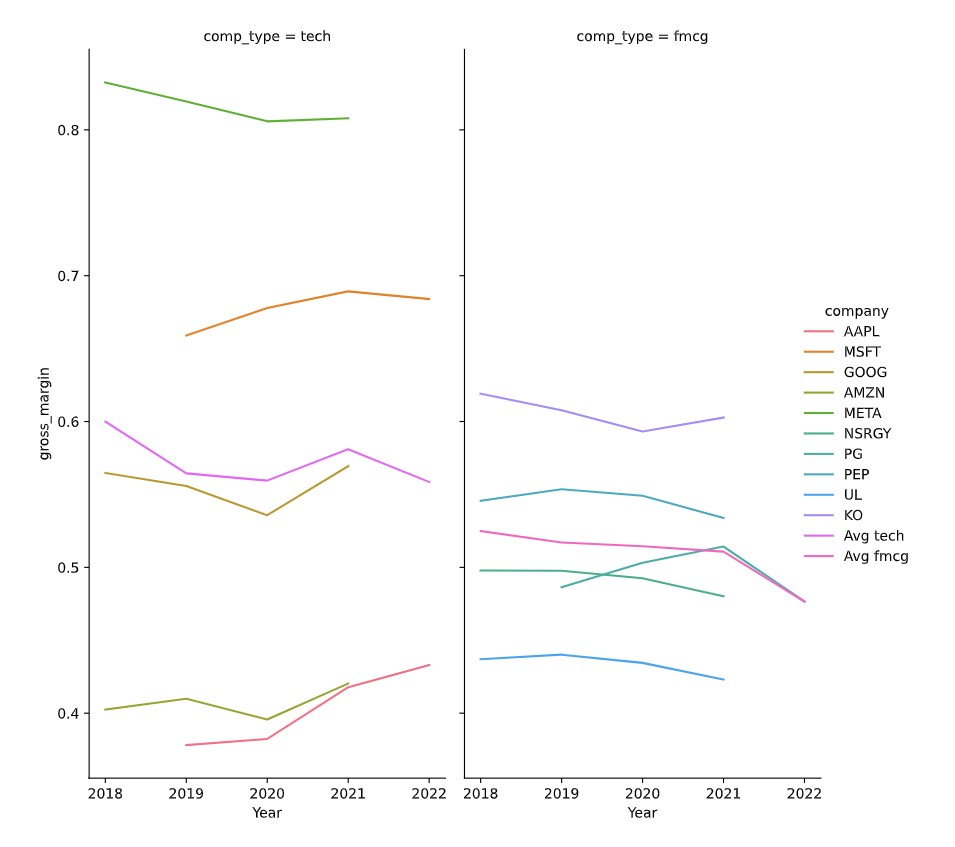
Sekarang saatnya membuat plot tersebut.
Latihan ini merupakan bagian dari kursus
Menganalisis Laporan Keuangan dengan Python
Instruksi latihan
- Gunakan DataFrame
plot_dfuntuk membuat facet grid plot seperti pada deskripsi menggunakanseaborn.
Latihan interaktif langsung praktik
Cobalah latihan ini dengan melengkapi kode contoh ini.
# Make the plot
sns.relplot(data=plot_df.reset_index(drop=True), ____)
plt.show()
plt.close()