Desentrañar el rendimiento de las campañas
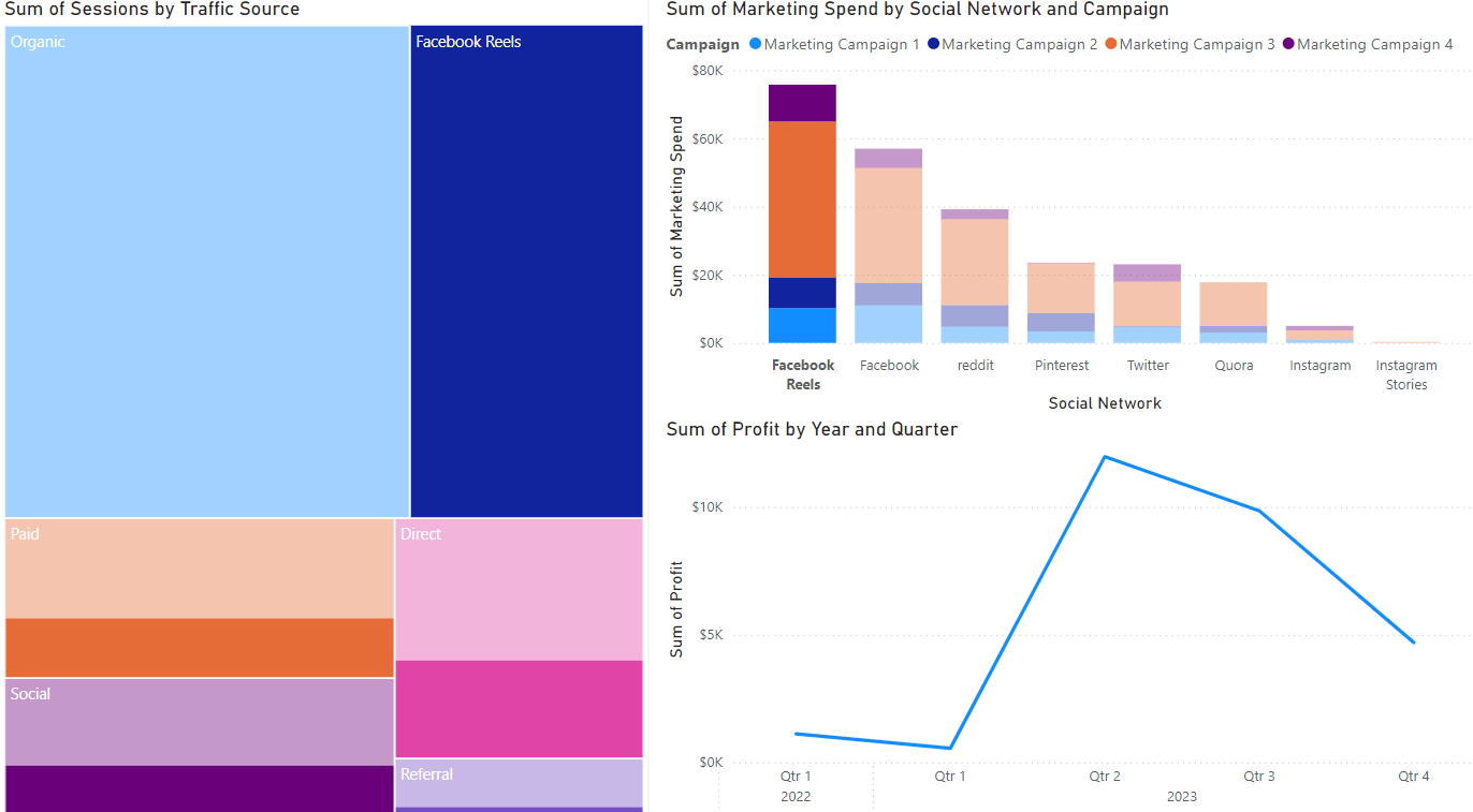
¡Hora de analizar campañas! Supón que creaste un mapa de árbol (sesiones por fuente de tráfico), un gráfico de barras (gasto de marketing por canal) y un gráfico de líneas (beneficio). La vista predeterminada de tu pestaña de informe se muestra a continuación.
Vamos a usar estas visualizaciones de Power BI para desmenuzar la campaña más rentable e identificar oportunidades de optimización.
Este ejercicio forma parte del curso
Power BI para usuarios finales
ejercicio interactivo práctico
Convierte la teoría en práctica con uno de nuestros ejercicios interactivos
 Empezar ejercicio