Kampagnenleistung aufschlüsseln
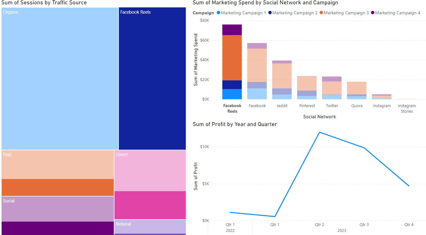
Zeit für die Kampagnenanalyse! Angenommen, du hast eine Tree-Map (Sessions nach Traffic-Quelle), ein Balkendiagramm (Marketingausgaben nach Kanal) und ein Liniendiagramm (Gewinn) erstellt. Die Standardansicht deines Bericht-Tabs ist unten zu sehen.
Nutzen wir diese Power BI-Visualisierungen, um die profitabelste Kampagne zu zerlegen und Optimierungspotenziale zu identifizieren.
Diese Übung ist Teil des Kurses
<Kurs>Power BI für Endanwender</Kurs>Interaktive praktische Übung
Verwandle Theorie mit einer unserer interaktiven Übungen in die Praxis
 Übung starten