Misleading news?
Good evening; this is your daily news update. Today, we bring you a concerning report on the increasing number of job losses that have left many individuals and families facing an uncertain future. Let's have a closer look at the data..
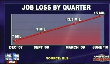
Source: https://www.businessinsider.com/the-27-worst-charts-of-all-time-2013-6
As an aspiring data visualization expert, you can surely detect several problems with this chart. Apart from rather obvious formatting imperfections, this chart is highly deceptive.
Can you identify the reason(s) why it is misleading?
This exercise is part of the course
Data Visualization in Excel
Hands-on interactive exercise
Turn theory into action with one of our interactive exercises
 Start Exercise