Representación de los datos
En python, todo es un objeto, incluso los módulos. Tu objetivo en este ejercicio es repasar el uso de las interfaces orientadas a objetos de la librería de python matplotlib para visualizar datos medidos con un flujo de trabajo más flexible y ampliable. El flujo de trabajo general para la representación es el siguiente:
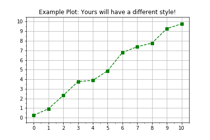
import matplotlib.pyplot as plt
fig, axis = plt.subplots()
axis.plot(x, y, color="green", linestyle="--", marker="s")
plt.show()
Este ejercicio forma parte del curso
Introducción al modelado lineal en Python
Instrucciones del ejercicio
- Usa
plt.subplots()para crear los objetos figure y axis. - Los datos se han proporcionado en dos arrays de
numpypredefinidos,timesydistances. - Usa
axis.plot()para representartimesen el eje horizontal ydistancesen el vertical. - Cuando llames a
axis.plot(), usa los argumentos con nombre de entradalinestyle=" ",marker="o"ycolor="red".
ejercicio interactivo práctico
Prueba este ejercicio completando este código de ejemplo.
# Create figure and axis objects using subplots()
fig, axis = plt.____()

# Plot line using the axis.plot() method
line = axis.plot(____ , ____ , linestyle="____", marker="____", color="____")

# Use the plt.show() method to display the figure
plt.____()