Gradient boosted trees: visualization
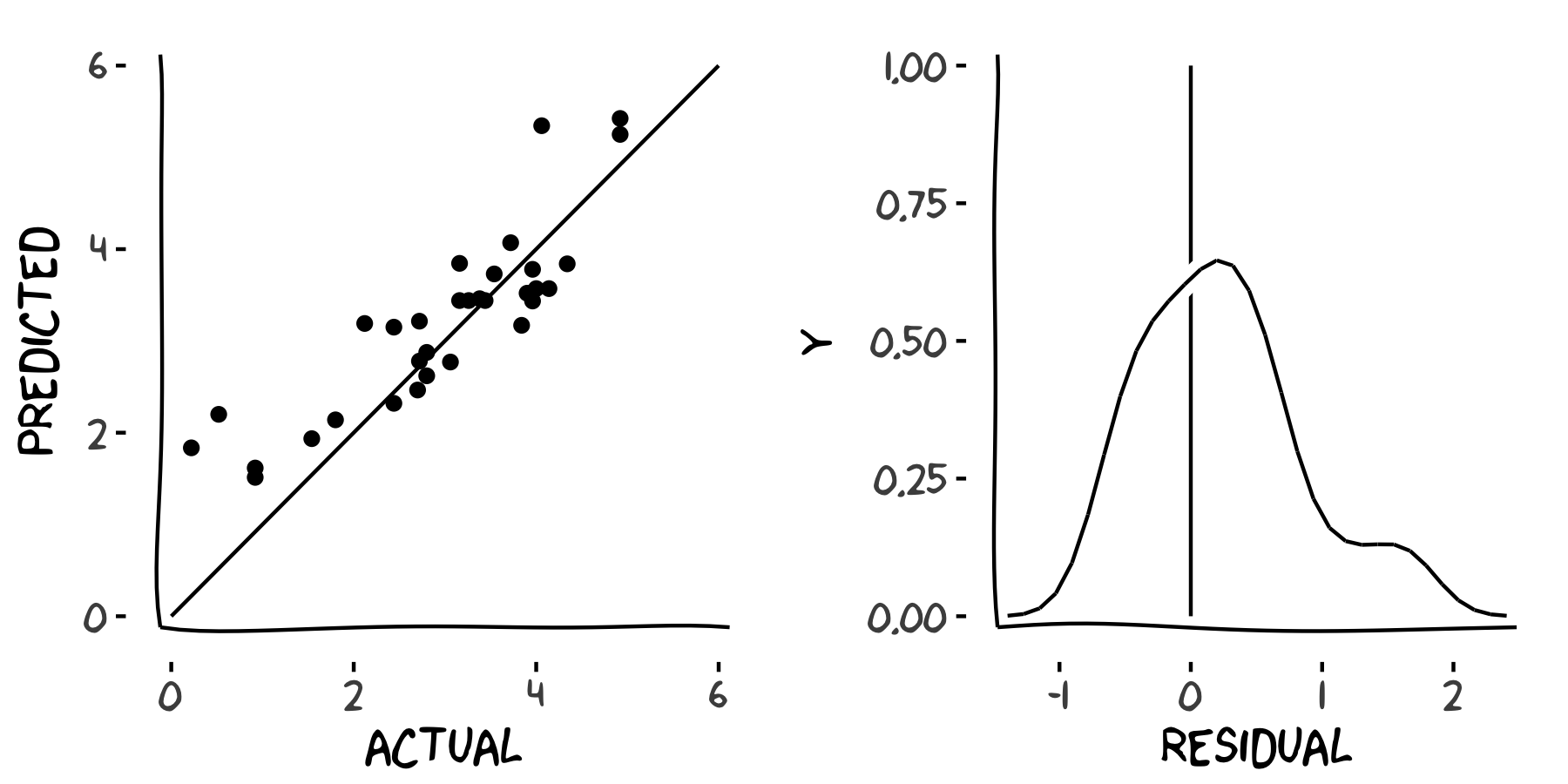
Now you have your model predictions, you might wonder "are they any good?". There are many plots that you can draw to diagnose the accuracy of your predictions; here you'll take a look at two common plots. Firstly, it's nice to draw a scatterplot of the predicted response versus the actual response, to see how they compare. Secondly, the residuals ought to be somewhere close to a normal distribution, so it's useful to draw a density plot of the residuals. The plots will look something like these.
In this exercise, you'll learn to calculate the residuals yourself (predicted responses minus actual responses) for your model predictions.
This exercise is part of the course
Introduction to Spark with sparklyr in R
Exercise instructions
A local tibble responses, containing predicted and actual years, has been pre-defined.
- Draw a scatterplot of predicted vs. actual responses.
- Call
ggplot(). - The first argument is the dataset,
responses. - The second argument should contain the unquoted column names for the x and y axes (
actualandpredictedrespectively), wrapped inaes(). - Add points by adding a call to
geom_point(). - Make the points partially transparent by setting
alpha = 0.1. - Add a reference line by adding a call to
geom_abline()withintercept = 0andslope = 1.
- Call
- Create a tibble of residuals, named
residuals.- Call
transmute()on theresponses. - The new column should be called
residual. residualshould be equal to the predicted response minus the actual response.
- Call
- Draw a density plot of residuals.
- Pipe the transmuted tibble to
ggplot(). ggplot()needs a single aesthetic,residualwrapped inaes().- Add a probability density curve by calling
geom_density(). - Add a vertical reference line through zero by calling
geom_vline()withxintercept = 0.
- Pipe the transmuted tibble to
Hands-on interactive exercise
Have a go at this exercise by completing this sample code.
# responses has been pre-defined
responses

# Draw a scatterplot of predicted vs. actual
ggplot(___, aes(___, ___)) +
  # Add the points
  ___ +
  # Add a line at actual = predicted
  ___

residuals <- responses %>%
  # Transmute response data to residuals
  ___

# Draw a density plot of residuals
ggplot(___, aes(___)) +
    # Add a density curve
    ___ +
    # Add a vertical line through zero
    ___