stripplot() and swarmplot()
Many datasets have categorical data and Seaborn supports several useful plot types for this data. In this example, we will continue to look at the 2010 School Improvement data and segment the data by the types of school improvement models used.
As a refresher, here is the KDE distribution of the Award Amounts:
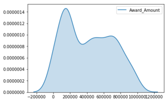
While this plot is useful, there is a lot more we can learn by looking at the individual Award_Amount and how
the amounts are distributed among the four categories.
This exercise is part of the course
Intermediate Data Visualization with Seaborn
Hands-on interactive exercise
Have a go at this exercise by completing this sample code.
# Create the stripplot
sns.____(data=df,
         x='____',
         y='____',
         jitter=____)

plt.show()