Remixing a plot
You find the relationship between the latitude of a farmer's market and the number of months the market was open fascinating. Intuitively as one gets further South, the growing seasons are longer, and thus the markets can stay open longer. To visualize this story, you summarize the market data at the state level and draw a heatmap with columns corresponding to the duration the markets are open. Each row in the heatmap shows the distribution of the market "season" for a state and rows are sorted in descending order of the state's latitude.
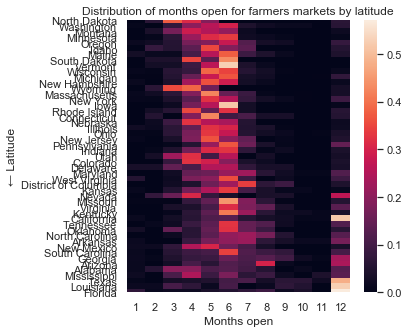
The default heatmap leaves a lot to be desired. Decrease the font size to allow each state name to fit without overlap. The dark color palette also clashes with the light background, and the colorbar doesn't help the reader as the point is relative comparisons.
This exercise is part of the course
Improving Your Data Visualizations in Python
Exercise instructions
- Decrease the font size to 85% of the default to un-crowd state names.
- Make new color palette that goes from
'white'to'steelblue'. - Replace the default palette with the newly created one.
- Remove the continuous color bar legend drawn next to heatmap.
Hands-on interactive exercise
Have a go at this exercise by completing this sample code.
# Decrease font size so state names are less crowded
sns.set(____ = ____)

# Switch to an appropriate color palette
blue_pal = sns.light_palette("____", as_cmap = True)

# Order states by latitude
g = sns.heatmap(markets_by_month.reindex(state_by_lat),
            # Add gaps between cells
            linewidths = 0.1,
            # Set new palette and remove color bar
            cmap = ____, cbar = ____,
            yticklabels = True)

# Rotate y-axis ticks
g.set_yticklabels(g.get_yticklabels(), rotation = 0)
plt.title('Distribution of months open for farmers markets by latitude')
plt.show()