Making a custom continuous palette
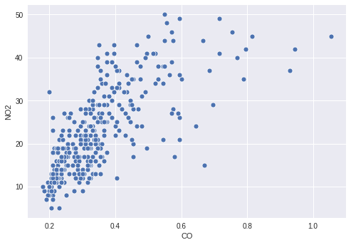
You are interested in the pollution levels of Cincinnati for the year 2014. Specifically, you're interested in CO and NO2, so you make a simple scatter plot to show the relationship between the two pollutants.
However, there may be some interesting information in how the value of O3 relates to the two plotted pollutants, so you decide to color the points by their O3 levels. To do this, you need to define an appropriate continuous palette and map your O3 column to it in your scatter plot.
This exercise is part of the course
Improving Your Data Visualizations in Python
Exercise instructions
- Create a palette that continuously maps from white to
'orangered'. - Map the column for
O3values to the color of the points. - Pass your created palette to the plotting function.
Hands-on interactive exercise
Have a go at this exercise by completing this sample code.
# Filter the data
cinci_2014 = pollution.query("city  ==  'Cincinnati' & year  ==  2014")

# Define a custom continuous color palette
color_palette = sns.____('orangered',
                         ____ = True)

# Plot mapping the color of the points with custom palette
sns.scatterplot(x = 'CO',
                y = 'NO2',
                ____ = 'O3',
                data = cinci_2014,
                palette = ____)
plt.show()