Fixing Seaborn's bar charts
Seaborn's default values for the colors of bars in a bar chart are not ideal for the most accurate perception. By drawing each bar as a different color, there is a risk of the viewer seeing two identical sized bars as different sizes as people tend to see some colors as 'larger' than others.
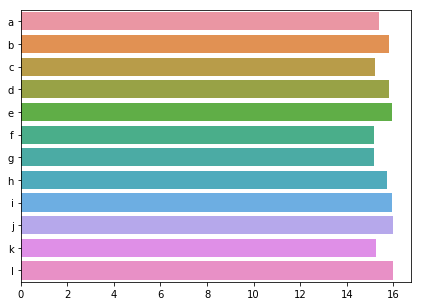
We discussed two easy ways to fix this. First, to put a border around the bars; second, change all bar colors to the same value. Try both of these solutions on our pollution data.
This exercise is part of the course
Improving Your Data Visualizations in Python
Hands-on interactive exercise
Have a go at this exercise by completing this sample code.
import numpy as np

sns.barplot(y = 'city', x = 'CO',
            estimator = np.mean,
            ci = False,
            data = pollution,
            # Add a border to the bars
            ____ = ____)
plt.show()