Getting rid of unnecessary color
You might want to compare the relationship CO to NO2 values across cities using a simple scatter plot with color to differentiate the different cities' data.
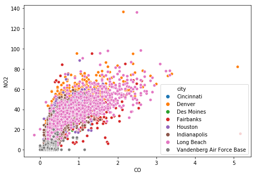
Unfortunately, the resulting plot is very convoluted. It's hard to make out differences between the cities because one has to differentiate between similar colors. It turns out that sometimes the best color palette for your plot is no color at all.
To remedy this hard-to-read chart, get rid of the color component and facet by each city. While the resulting plot may not be as pretty, it will be a much better tool to decipher the differences.
This exercise is part of the course
Improving Your Data Visualizations in Python
Exercise instructions
- To set up a chart faceted by the
city, pass the plotting function thepollutiondata, map the city to the columns, and make the facet three columns wide. - Use the
g.map()function to map ascatterplot()over our grid with the same aesthetic as the original scatter but without thehueargument.
Hands-on interactive exercise
Have a go at this exercise by completing this sample code.
# Hard to read scatter of CO and NO2 w/ color mapped to city
# sns.scatterplot('CO', 'NO2',
#                 alpha = 0.2,
#                 hue = 'city',
#                 data = pollution)

# Setup a facet grid to separate the cities apart
g = sns.FacetGrid(data = ____,
                  col = '____',
                  col_wrap = ____)

# Map sns.scatterplot to create separate city scatter plots
g.map(sns.____, 'CO', 'NO2', alpha = 0.2)
plt.show()