Choosing the right variable to encode with color
You're tasked with visualizing pollution values for Long Beach and nearby cities over time. The supplied code makes the below (hard-to-read plot), which consists of maximum pollution values (provided as max_pollutant_values) with the bars colored by the city.
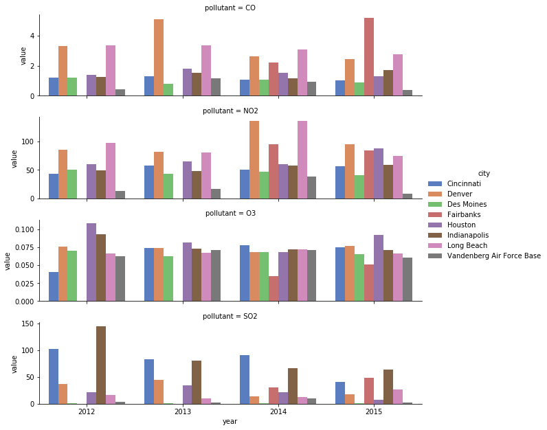
You can quickly improve this with a few tweaks. By modifying the cities shown to only those in the western half of the country you will avoid clutter. Next, swapping the color-encoding from city to year allows you to use an ordinal palette, saving the reader from continually referring to the legend to check which color corresponds to which city.
This exercise is part of the course
Improving Your Data Visualizations in Python
Exercise instructions
- Remove
'Indianapolis','Des Moines','Cincinnati','Houston'from thecitiesvector. - Swap the encodings of the
cityandyearvariables. - Use the
'BuGn'ColorBrewer palette to map your colors appropriately for the newly ordinal variable.
Hands-on interactive exercise
Have a go at this exercise by completing this sample code.
# Reduce to just cities in the western half of US
cities = ['Fairbanks', 'Long Beach', 'Vandenberg Air Force Base', 'Denver',
          'Indianapolis', 'Des Moines', 'Cincinnati', 'Houston']

# Filter data to desired cities
city_maxes = max_pollutant_values[max_pollutant_values.city.isin(cities)]

# Swap city and year encodings
sns.catplot(x = 'year', hue = 'city',
              y = 'value', row = 'pollutant',
              # Change palette to one appropriate for ordinal categories
              data = city_maxes, palette = 'muted',
              sharey = False, kind = 'bar')
plt.show()