Tab layouts
Displaying several tables and plots on the same page can lead to visual clutter and distract users of the app. In such cases, the tab layout comes in handy, as it allows different outputs to be displayed as tabs.
In this exercise, we will start with the Shiny app using the sidebar layout from the last exercise and modify it to use tabs. This exercise should also make it very clear that Shiny makes it really easy to switch app layouts with only a few modifications to the code.
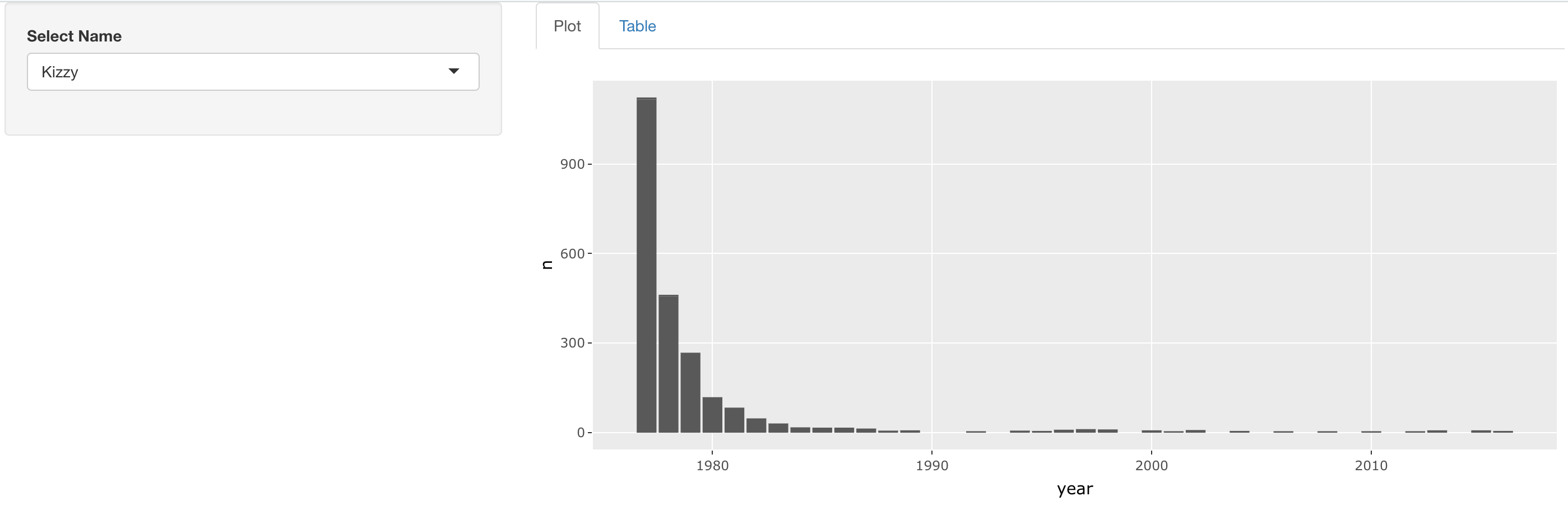
Your final app should visually resemble this:
This exercise is part of the course
Building Web Applications with Shiny in R
Exercise instructions
- Modify the layout of this app so that the name selector appears in the sidebar and the plot and table appear as separate tabs on the right. Don't forget to label the tabs!
Hands-on interactive exercise
Have a go at this exercise by completing this sample code.
ui <- fluidPage(
  sidebarLayout(
    sidebarPanel(
      selectInput('name', 'Select Name', top_trendy_names$name)
    ),
    mainPanel(
      # MODIFY CODE BLOCK BELOW: Wrap in a tabsetPanel
        # MODIFY CODE BELOW: Wrap in a tabPanel providing an appropriate label
        plotly::plotlyOutput('plot_trendy_names'),
        # MODIFY CODE BELOW: Wrap in a tabPanel providing an appropriate label
        DT::DTOutput('table_trendy_names')
    )
  )
)

server <- function(input, output, session){
  # Function to plot trends in a name
  plot_trends <- function(){
     babynames %>%
      filter(name == input$name) %>%
      ggplot(aes(x = year, y = n)) +
      geom_col()
  }
  output$plot_trendy_names <- plotly::renderPlotly({
    plot_trends()
  })

  output$table_trendy_names <- DT::renderDT({
    babynames %>%
      filter(name == input$name)
  })
}

shinyApp(ui = ui, server = server)