Explore cuisines: top ingredients redux
Each cuisine is distinct because of a small set of distinct ingredients. We can't surface these by looking at the most popular ingredients, since they're the bread-and-butter ingredients of cooking like salt or sugar.
Another metric that can aid us in this quest is the term frequency–inverse document frequency (TFIDF), a numerical statistic that is intended to reflect how important a word (ingredient) is to a document (cuisine) in a collection or corpus (recipes).
We already precomputed the tf_idf for you and created an enriched dataset named recipes_enriched. Your goal is to create a Shiny app that displays a horizontal bar plot of the top distinctive ingredients in a cuisine, as measured by tf_idf.
You will use a reactive expression to encapsulate the computations and let the plotting code focus only on creating the plot. This is good programming practice and helps create modular and performant Shiny apps.
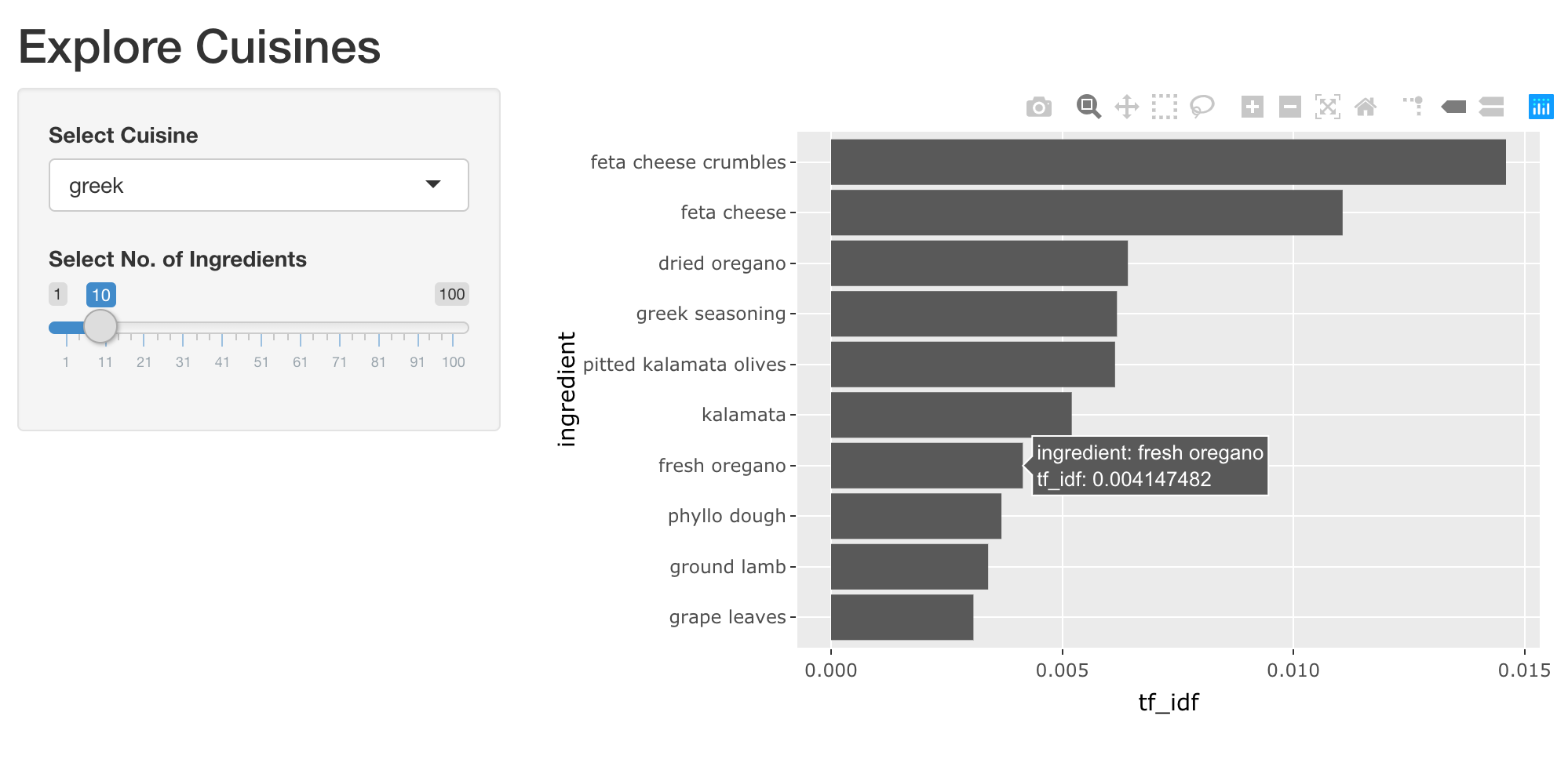
We have loaded the packages shiny, dplyr, ggplot2 and plotly. Here are two handy snippets to filter for the top recipes by cuisine and create a horizontal bar plot. You can modify it appropriately.
top_ingredients <- recipes_enriched %>%
  filter(cuisine == 'greek') %>%
  arrange(desc(tf_idf)) %>%
  head(5)

ggplot(top_ingredients, aes(x = ingredient, y = tf_idf)) +
  geom_col() +
  coord_flip()
This exercise is part of the course
Building Web Applications with Shiny in R
Exercise instructions
UI:
- Add an interactive plotly output named
plot_top_ingredientsand wrap in atabPanel()with an appropriate label.
- Add an interactive plotly output named
Server:
- Add a reactive expression named
rval_top_ingredientsthat filtersrecipes_enrichedfor the selected cuisine and top distinctive ingredients based on thetf_idfvalue. - Render an interactive bar plot of top ingredients and their
tf_idfand assign it to an output namedplot_top_ingredients. As an extra challenge for yourself, see if you can get the bars to display in descending order oftf_idf.
- Add a reactive expression named
Hands-on interactive exercise
Have a go at this exercise by completing this sample code.
ui <- fluidPage(
  titlePanel('Explore Cuisines'),
  sidebarLayout(
    sidebarPanel(
      selectInput('cuisine', 'Select Cuisine', unique(recipes$cuisine)),
      sliderInput('nb_ingredients', 'Select No. of Ingredients', 1, 100, 10),
    ),
    mainPanel(
      tabsetPanel(
        # CODE BELOW: Add a plotly output named "plot_top_ingredients"

        tabPanel('Table', DT::DTOutput('dt_top_ingredients'))
      )
    )
  )
)

server <- function(input, output, session) {
  # CODE BELOW: Add a reactive expression named `rval_top_ingredients` that
  # filters `recipes_enriched` for the selected cuisine and top ingredients
  # based on the tf_idf value.


  # CODE BELOW: Render a horizontal bar plot of top ingredients and
  # the tf_idf of recipes they get used in, and assign it to an output named
  # `plot_top_ingredients`


  output$dt_top_ingredients <- DT::renderDT({
    recipes %>%
      filter(cuisine == input$cuisine) %>%
      count(ingredient, name = 'nb_recipes') %>%
      arrange(desc(nb_recipes)) %>%
      head(input$nb_ingredients)
  })
}

shinyApp(ui, server)